
Hotel booking process
A redesign of the hotel booking experience, aimed at streamlining the process and making it more intuitive, accessible, and user-friendly. The project prioritised clear pricing, informative visuals, and upfront filters with interactive maps — allowing users to easily explore, compare, and confidently book their stays, with the freedom to change their minds and start fresh at any point.

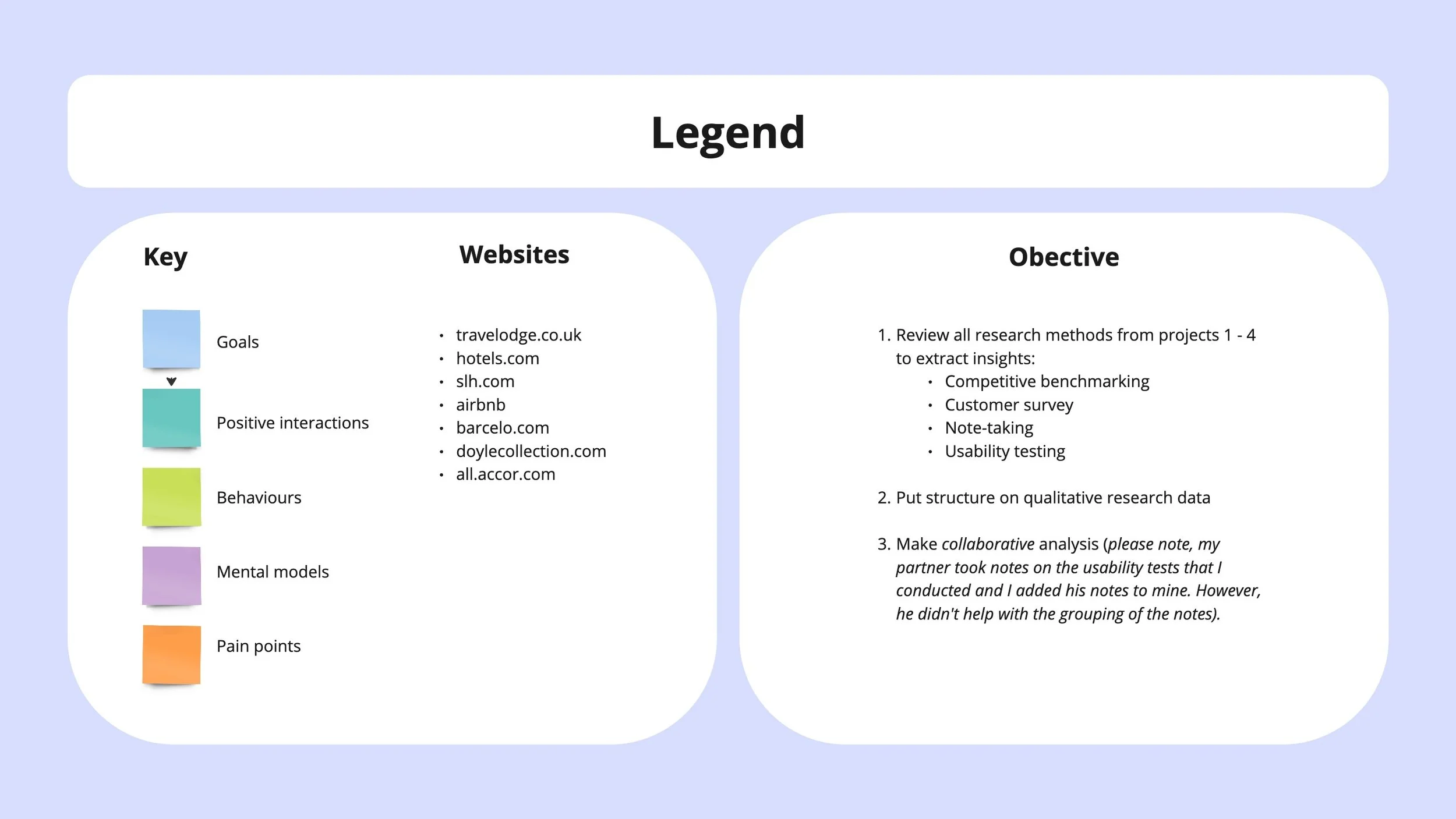
Research methodologies
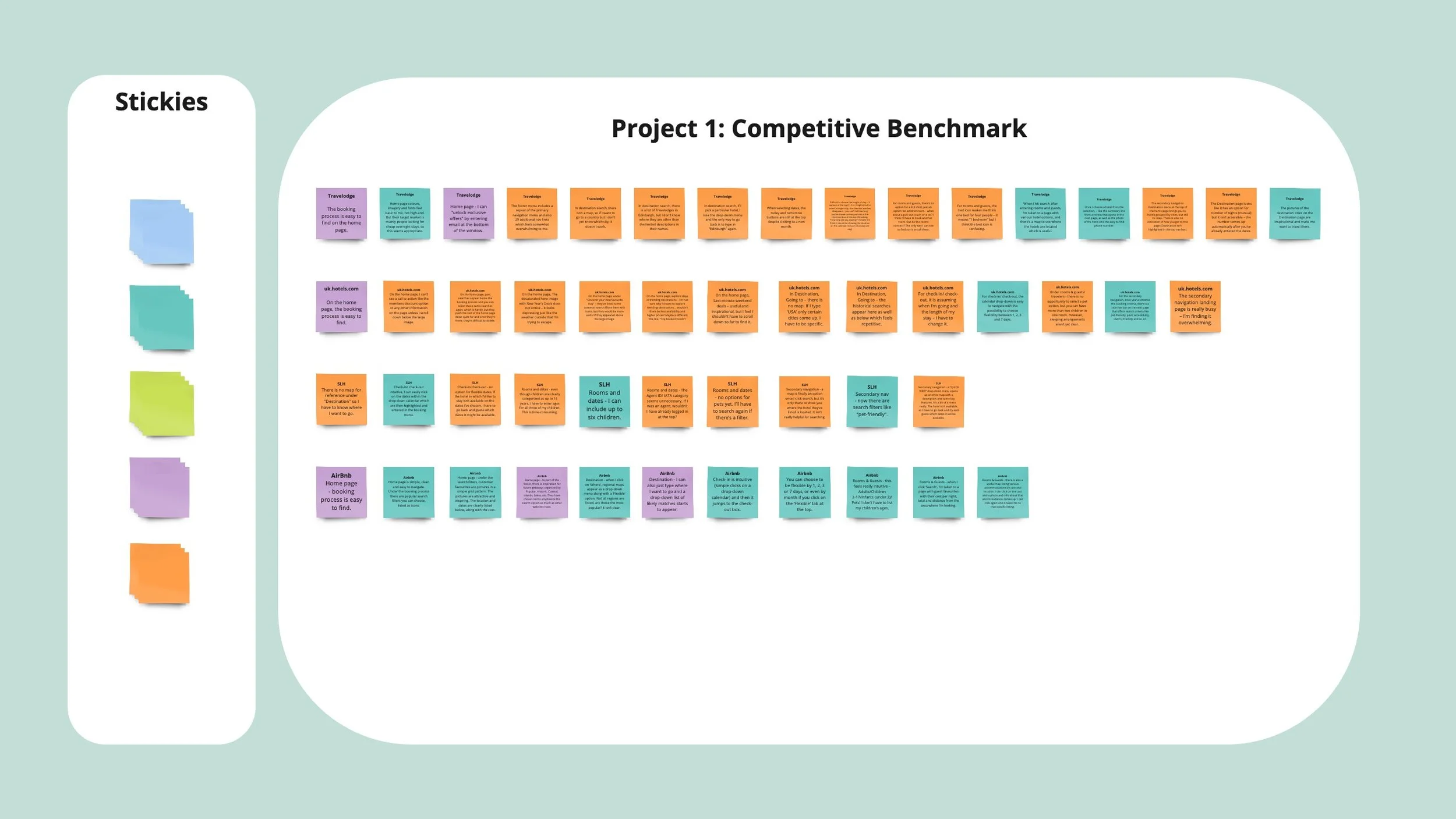
Competitors: Travelodge, Hotels.com, Small Luxury Hotels of the World and airbnb
Focus area: Home page and navigation, search and select, booking process
Test scenario: Book one hotel room for 2 adults, 3 children and a dog, if possible.
Competitive benchmarking
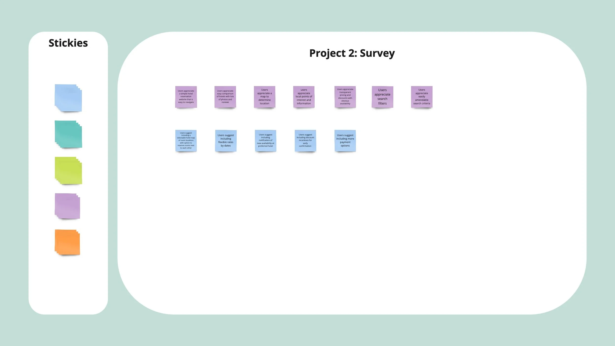
Distribution: WhatsApp, email
Survey tool: Google forms
Participants: 17
Number of questions: 8-9
Time to complete: 3-5 minutes
Survey duration: 3 days
Date: from 4 Feb to 7 Feb
Survey
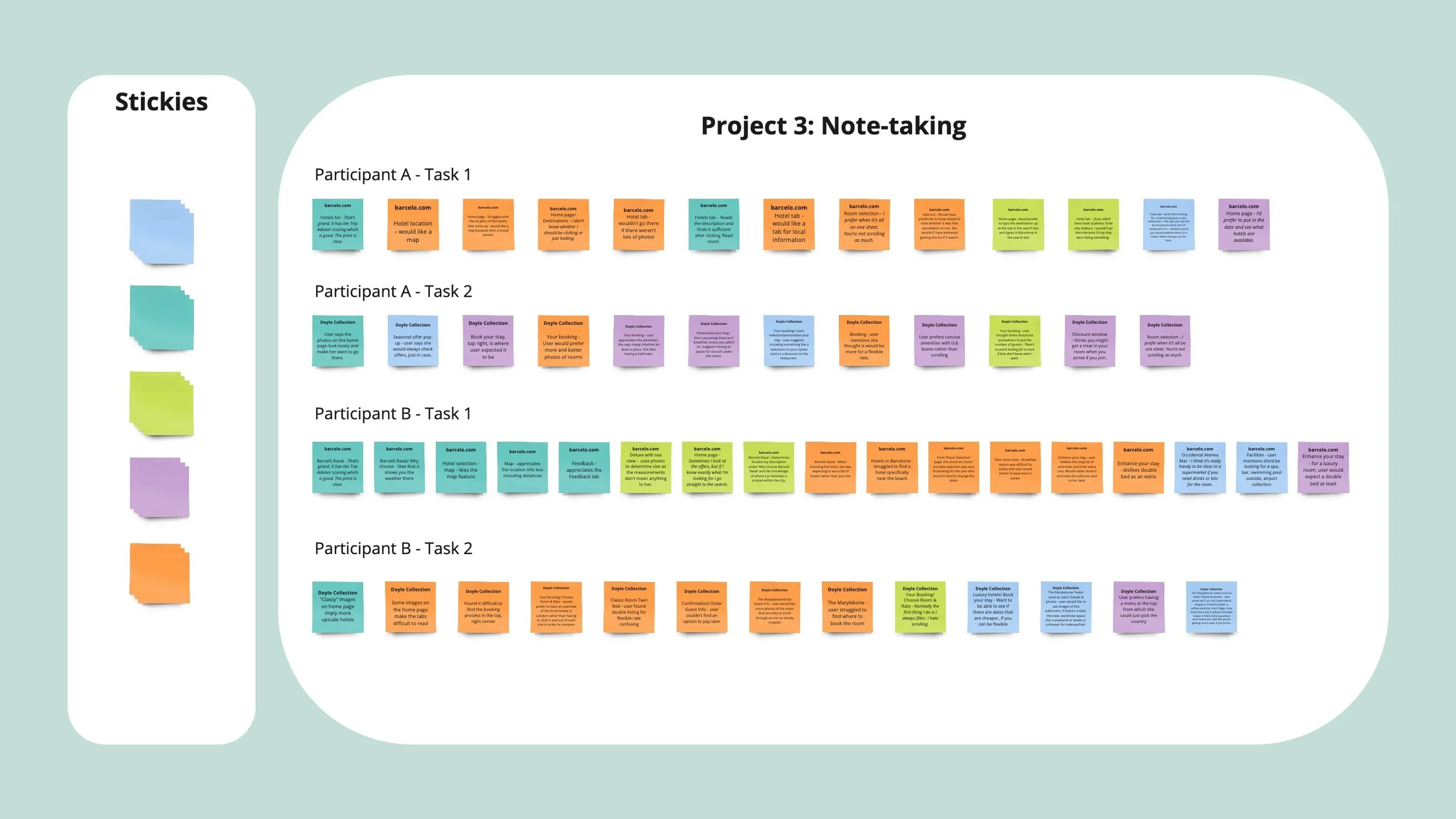
Test type: Moderated remote usability tests
Participants: 3
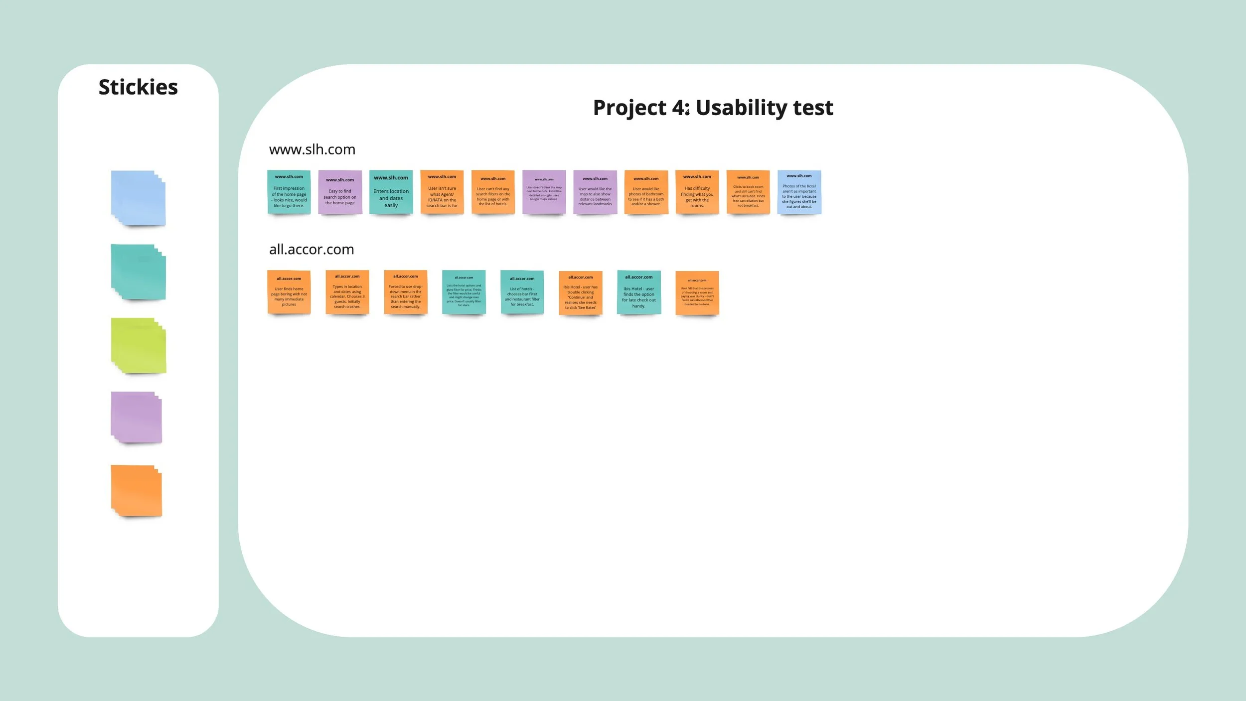
Test scope: Participants were asked to book a holiday based on specific criteria using barcelo.com, doylecollection.com, slh.com and all.accor.com
User testing
Affinity diagram
I conducted a card sorting exercise, gathering all the research notes on virtual post-its via Miro and organising them into categories to identify key themes emerging from the data.
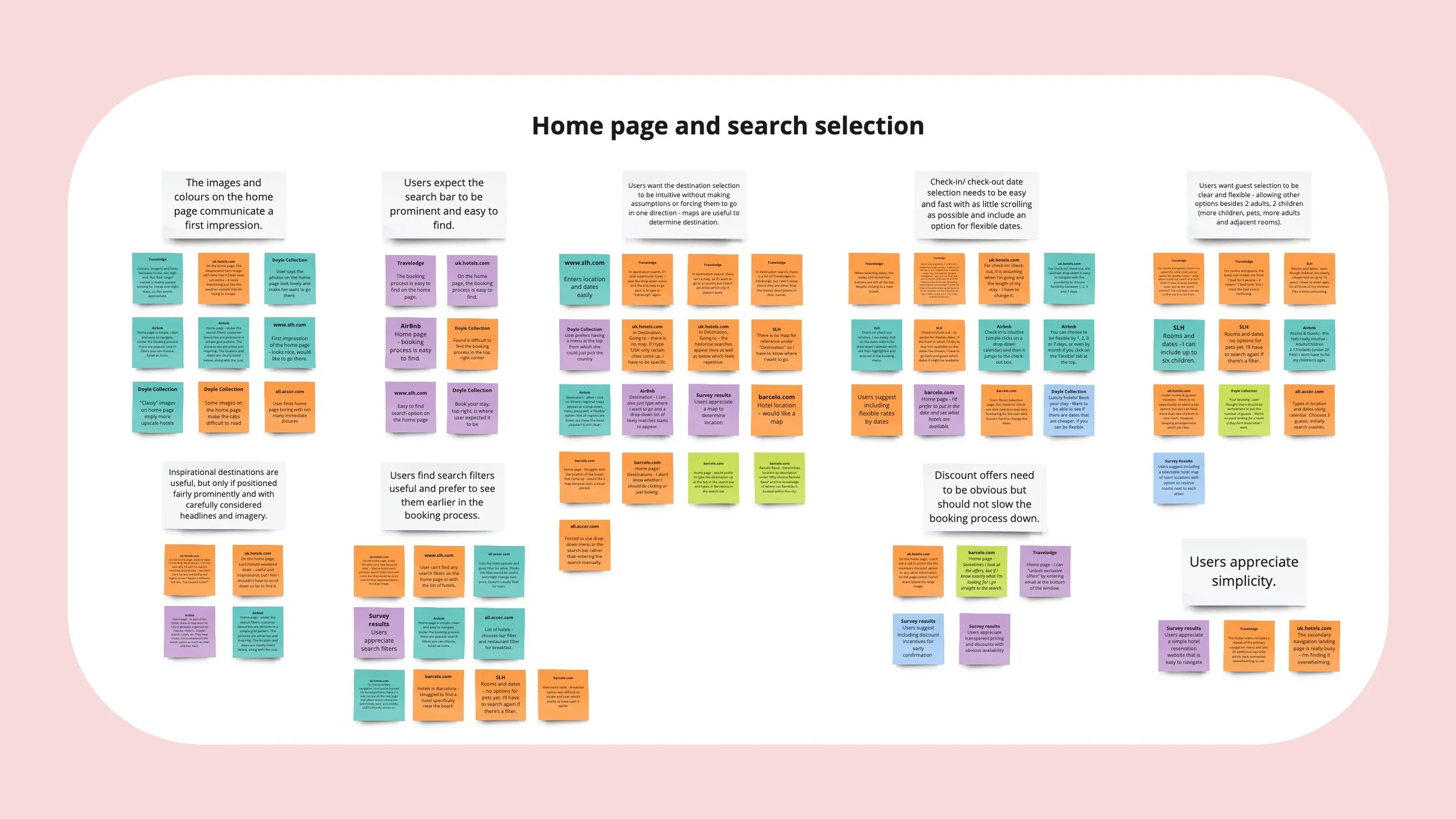
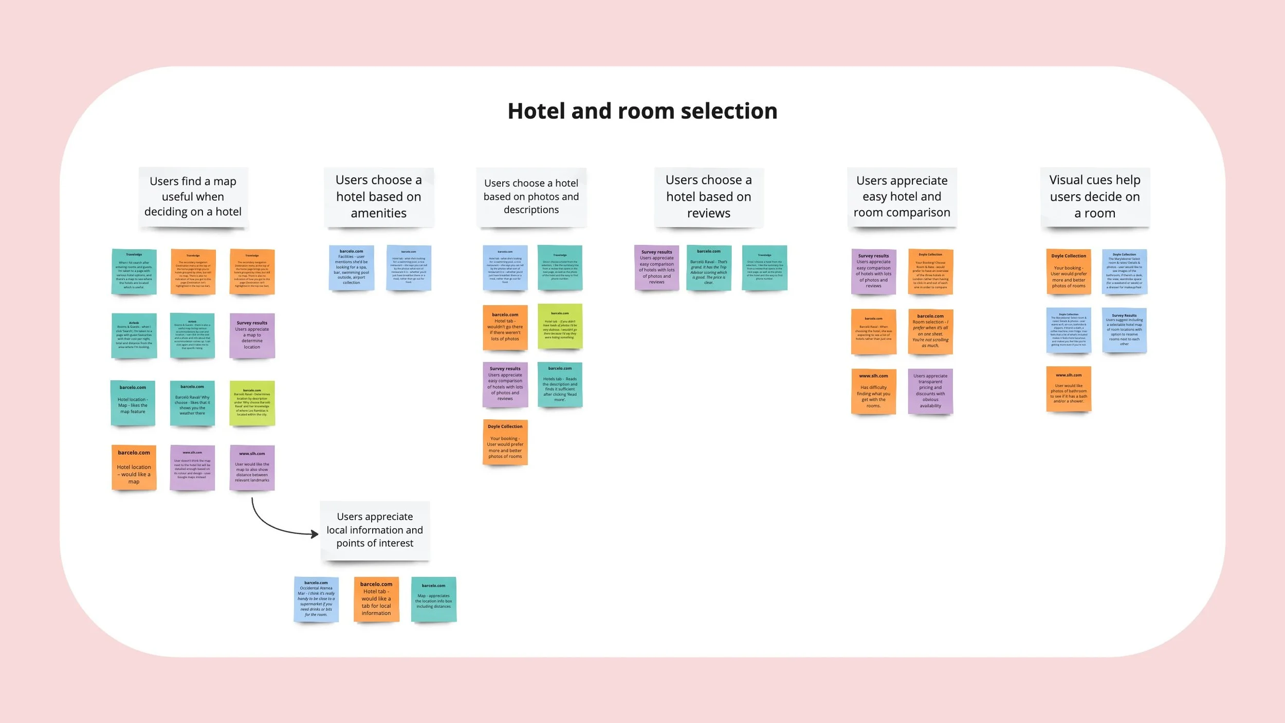
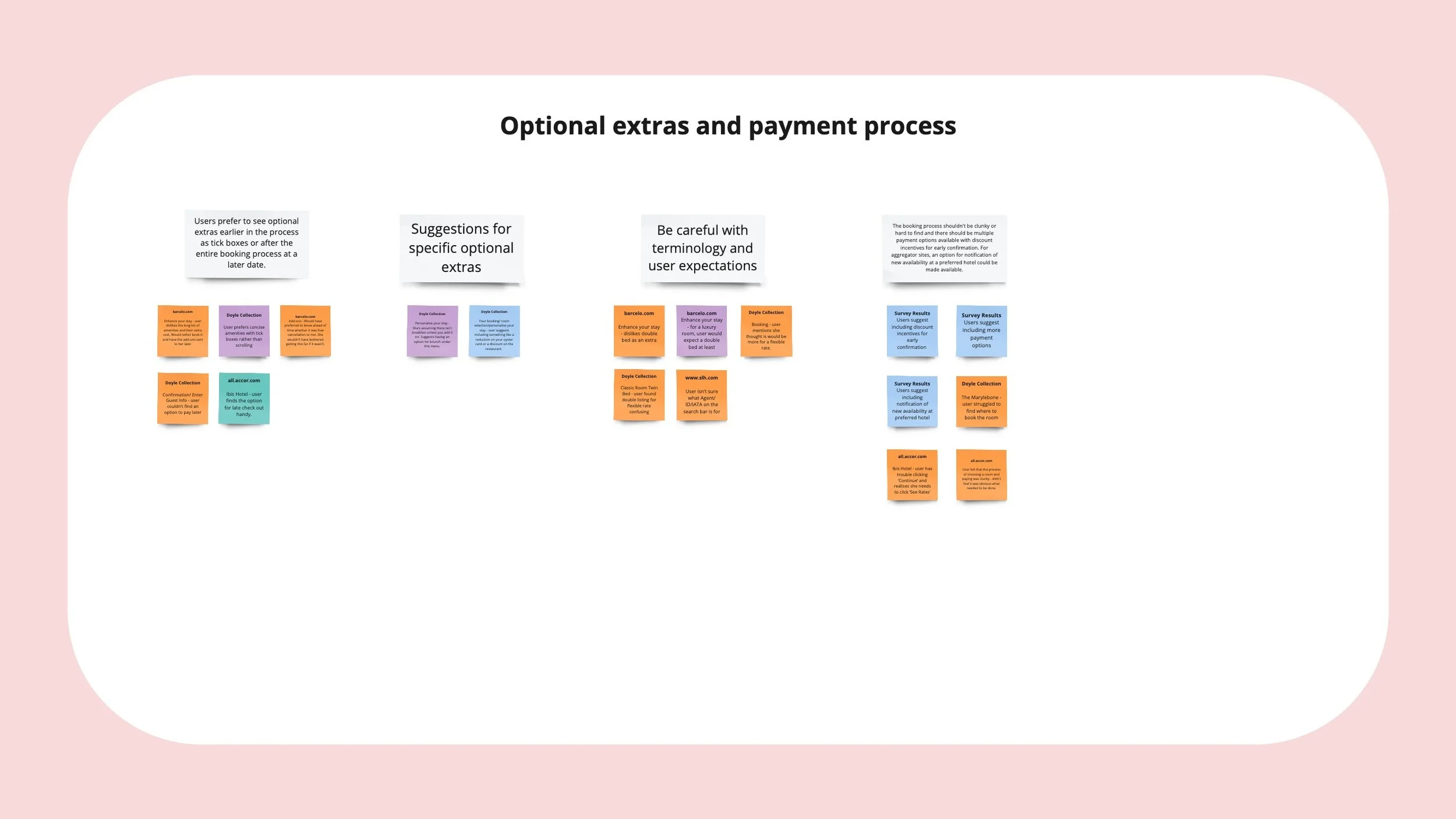
Research insights
Through my research, I found that although many hotel booking processes were already very good, there was always room for improvement.
Users appreciated:
Simple navigation and reduced clutter
Descriptive photos and reviews
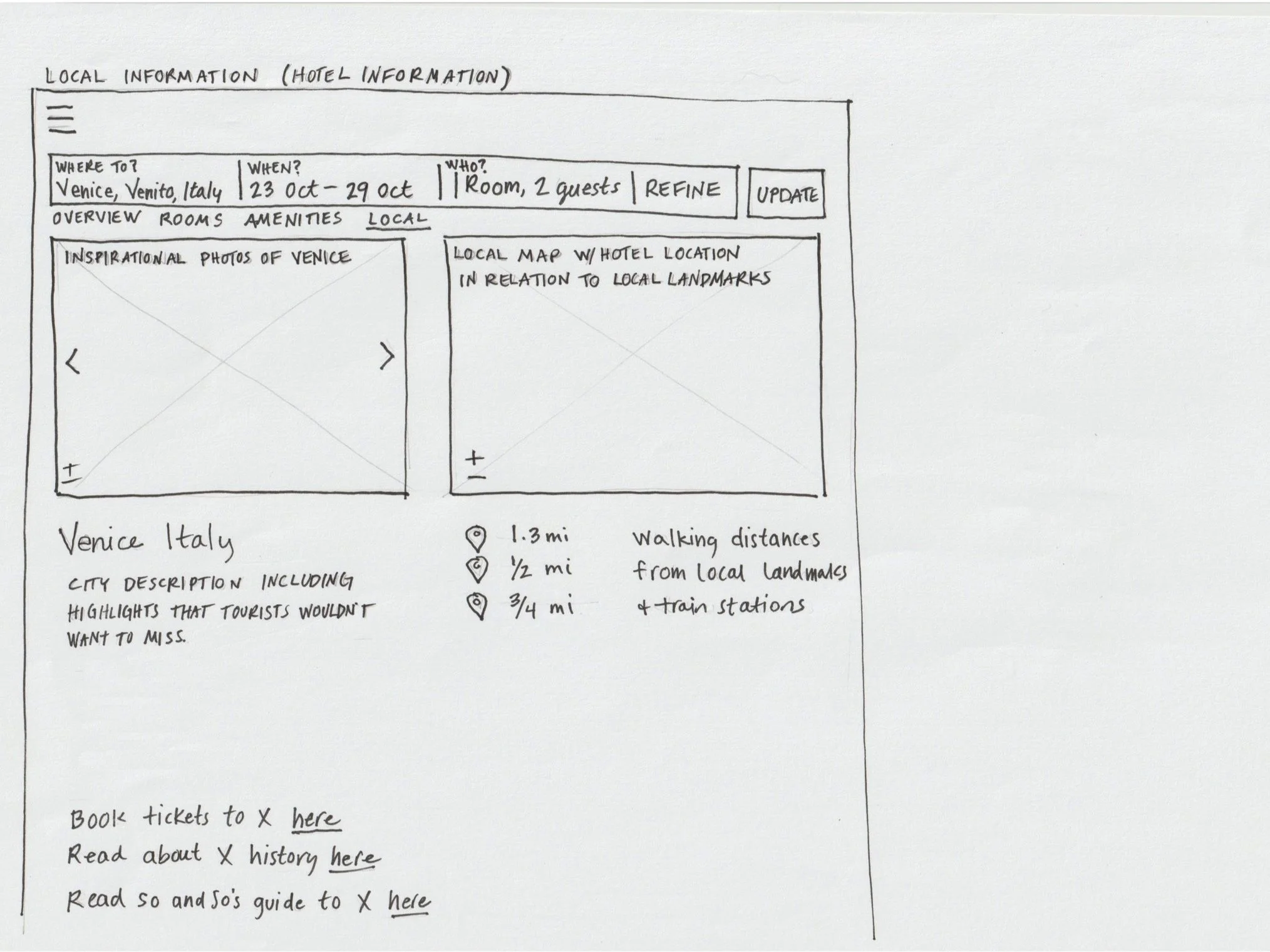
A map to determine the locale
Local points of interest
Plenty of search filters up front
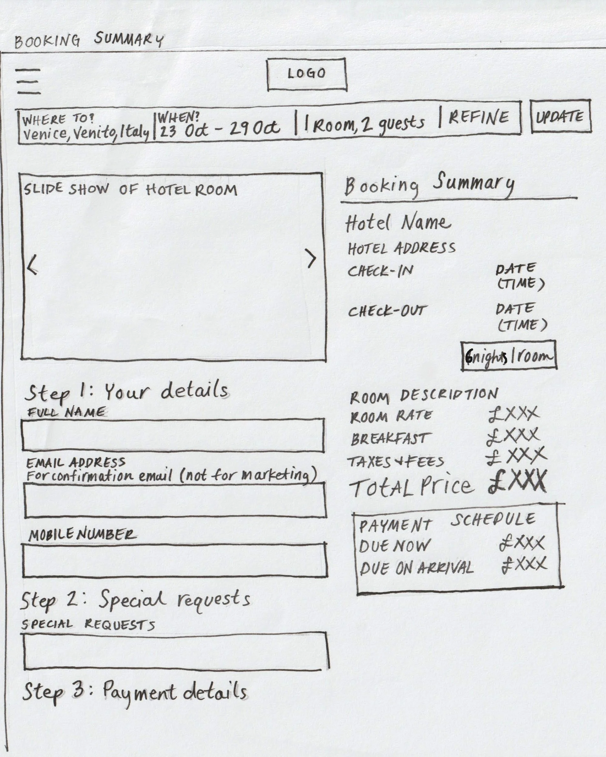
Transparent pricing
Discounts with obvious availability
Easily amendable search criteria
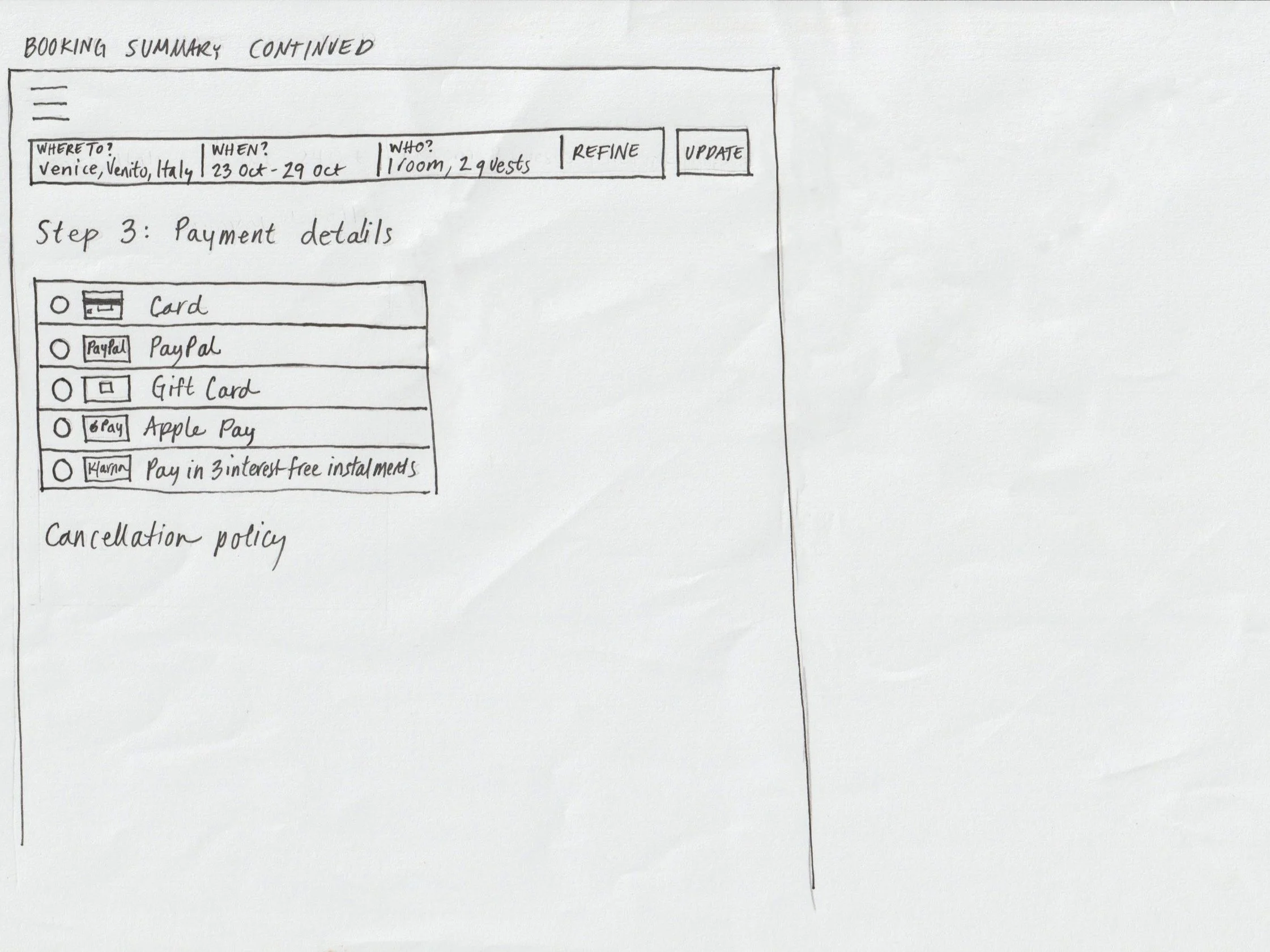
Some suggestions for additional functionality included a selectable hotel map of room locations with the option to reserve rooms next to each other, flexible rates by dates, notification of new availability at a preferred hotel, discount incentives for early confirmation and more payment options.
Customer journey map
I translated these findings into a customer journey map, highlighting opportunities for improvement at each stage of the hotel booking process.

“I’d prefer to put in the date and see what hotels are available.”
“If you didn’t have loads of photos I’d be very dubious. I wouldn’t go there because I’d say they were hiding something.”
“I wouldn’t bother going through all this hassle unless it’s free cancellation.”
Flow chart
I mapped the user flow for a primary use case, outlining all the screens a user would encounter and the key actions required at each step. This was done at a high level, with additional detail provided where necessary to identify potential issues.

Interaction sketches
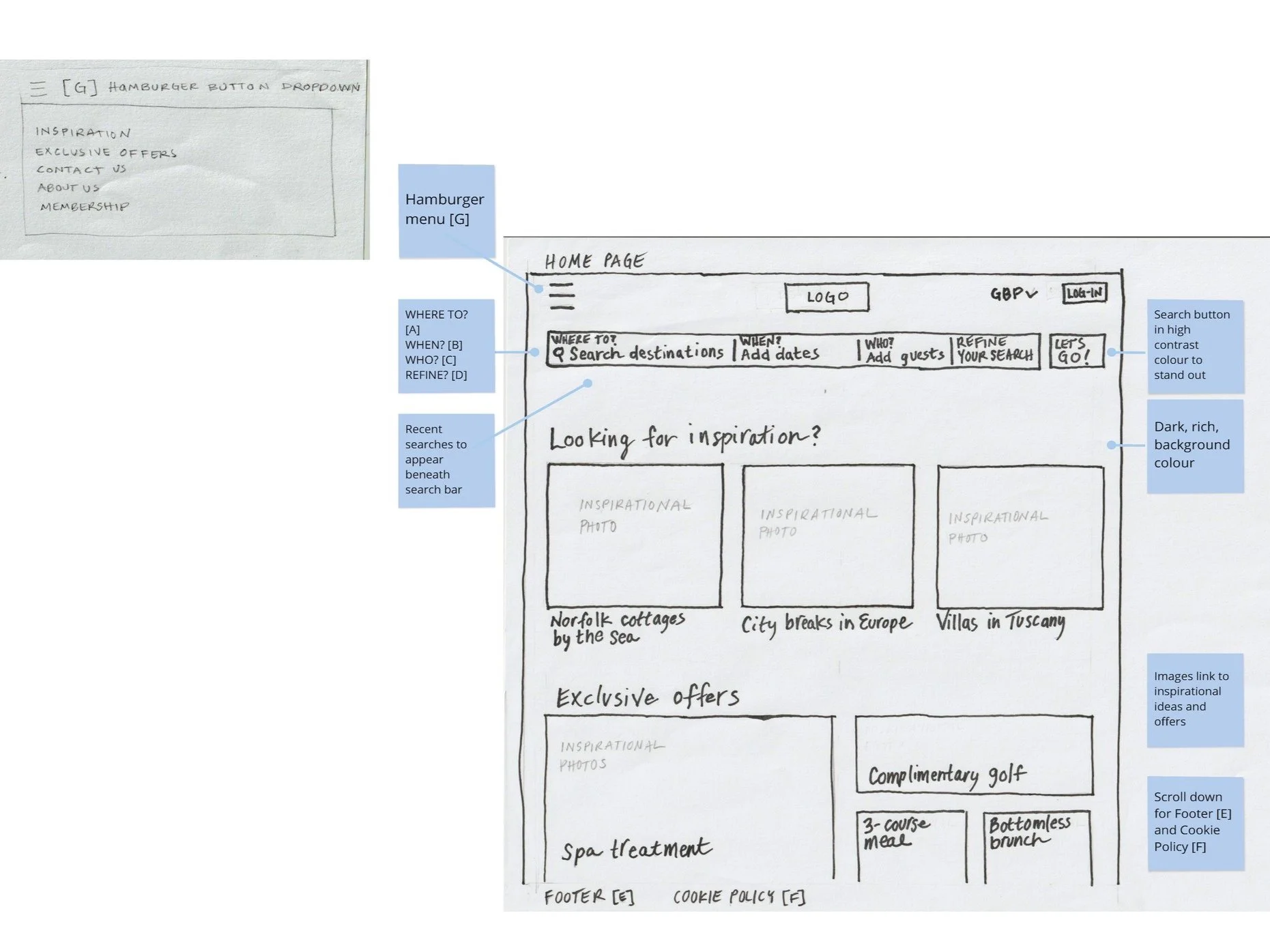
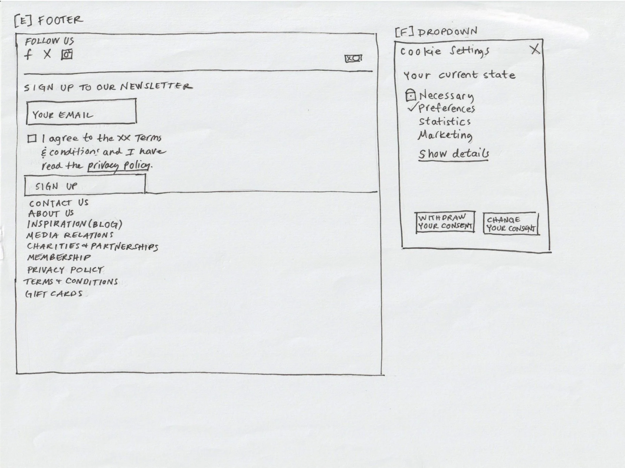
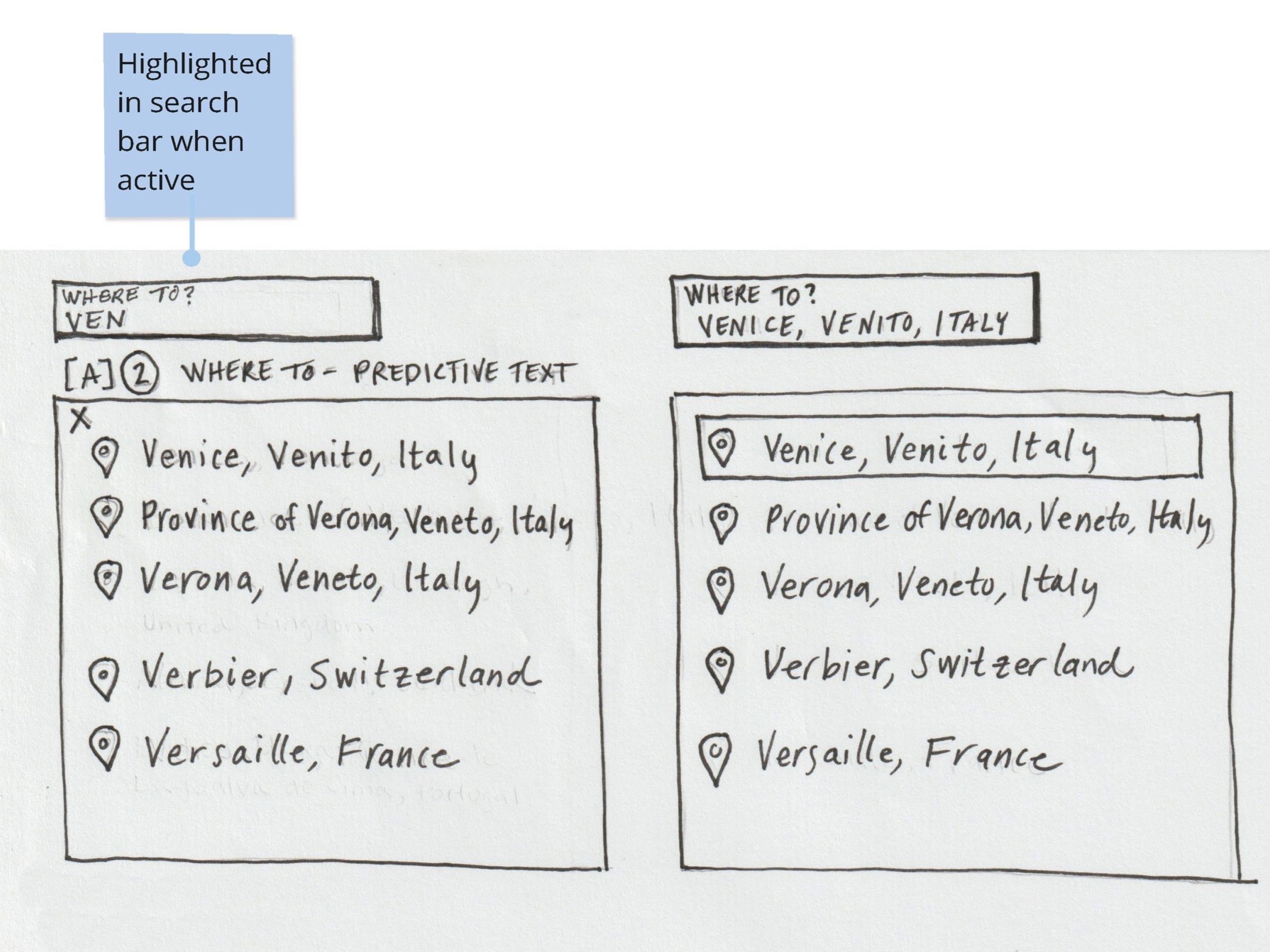
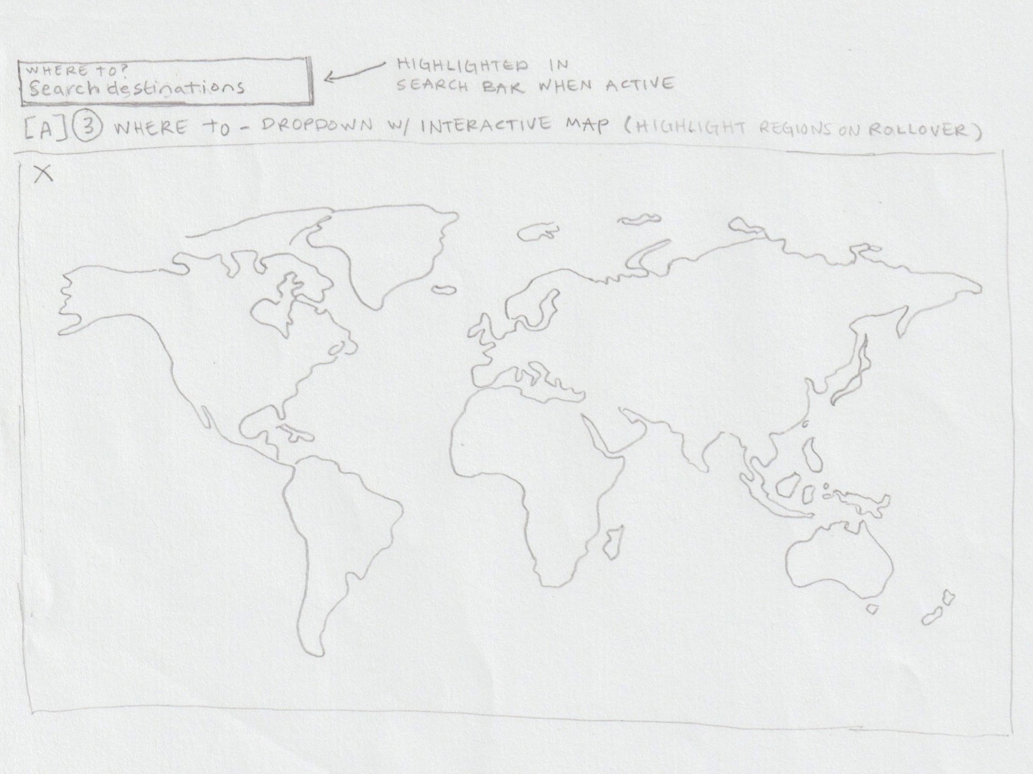
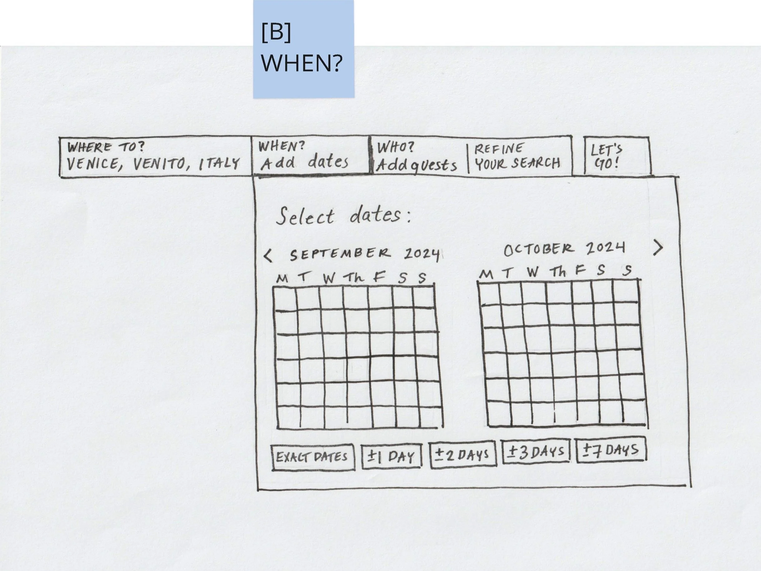
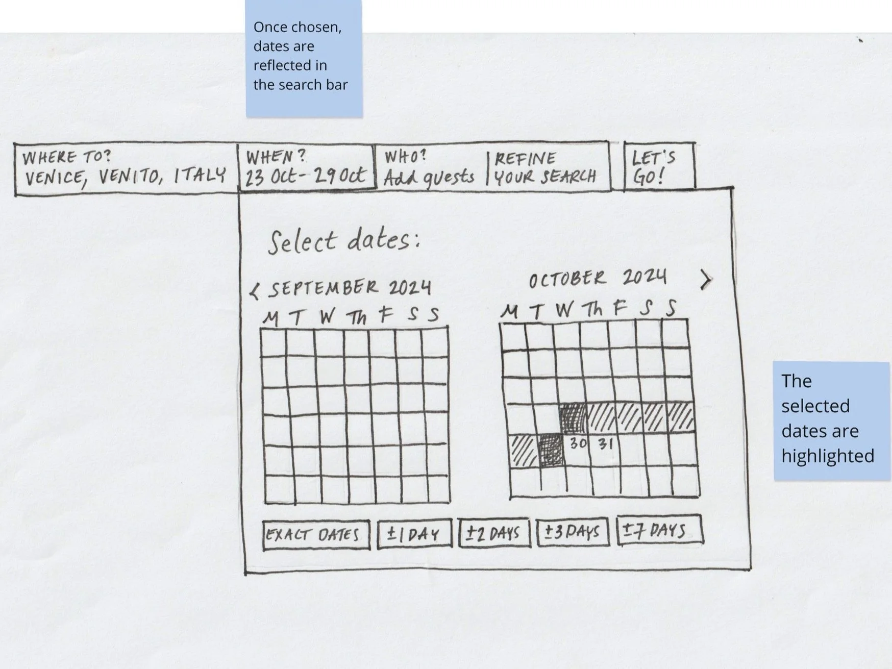
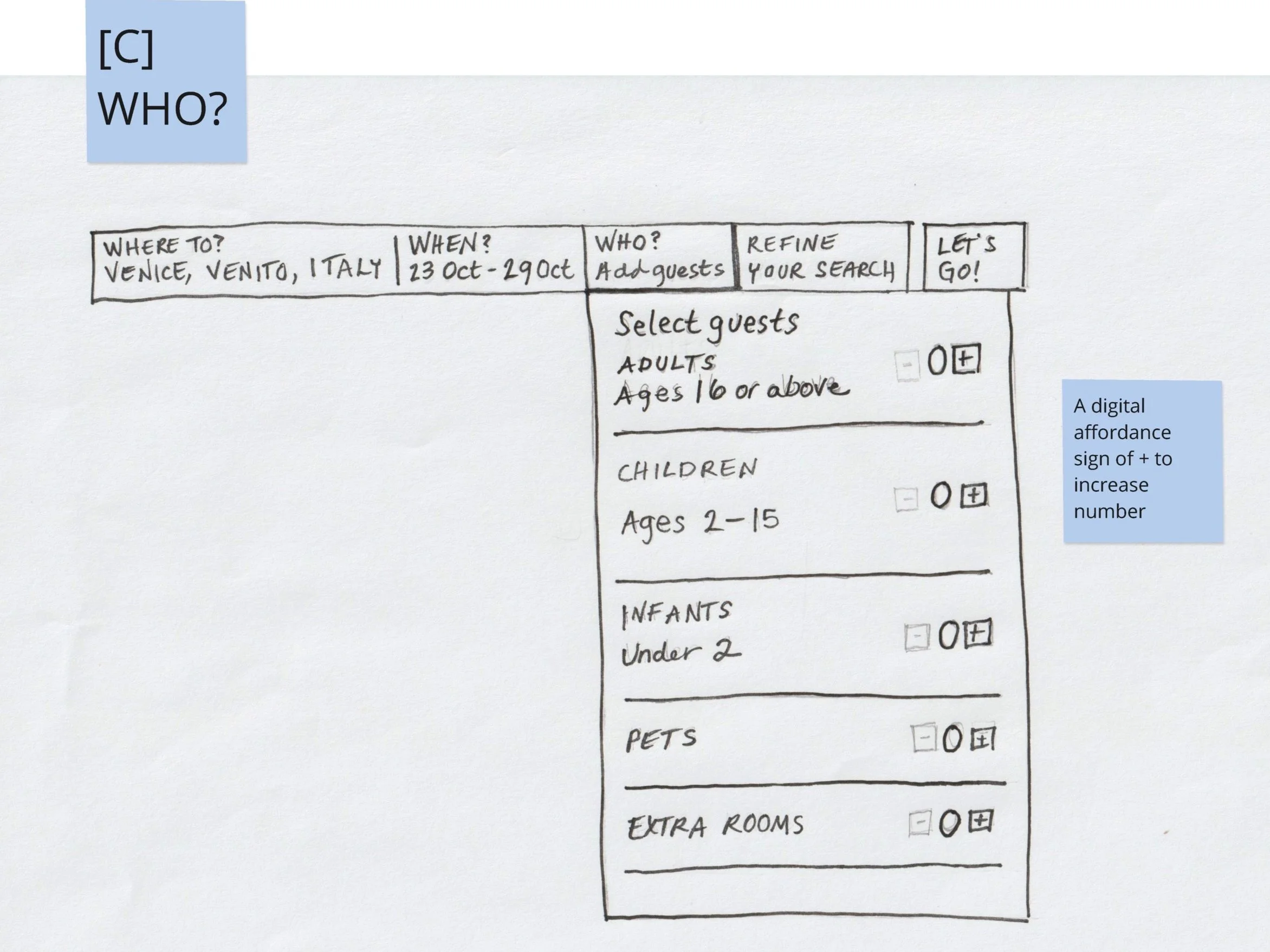
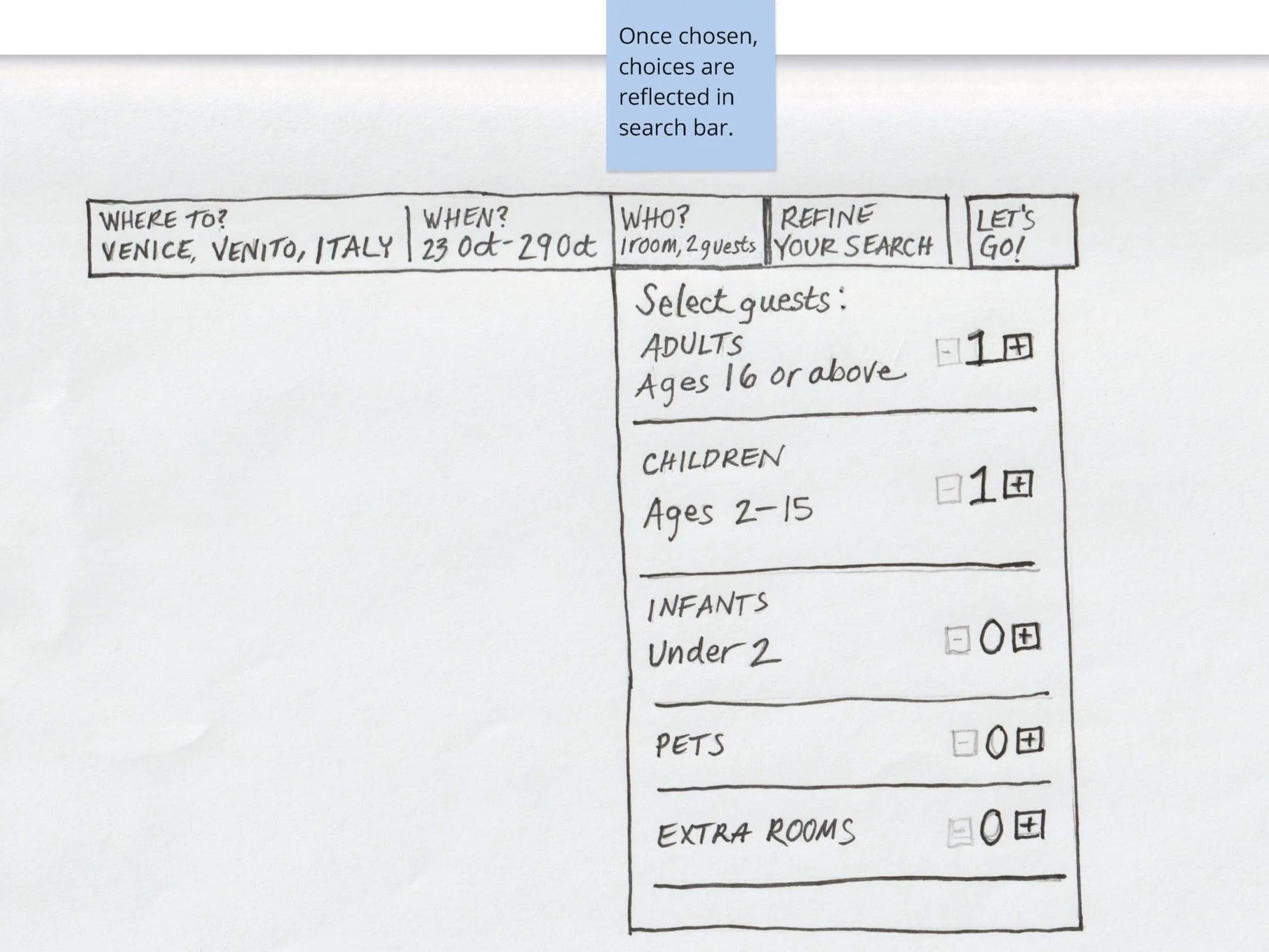
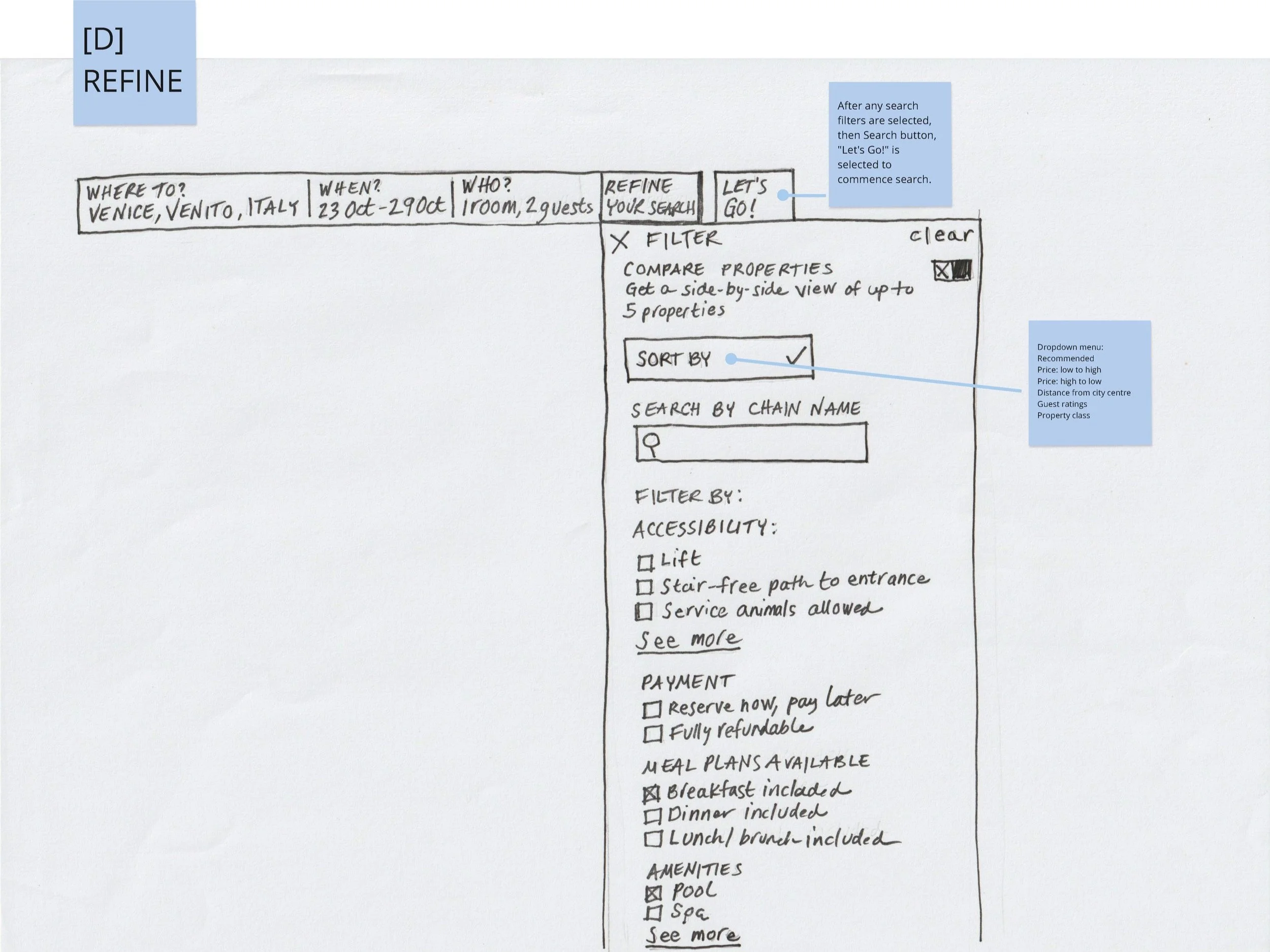
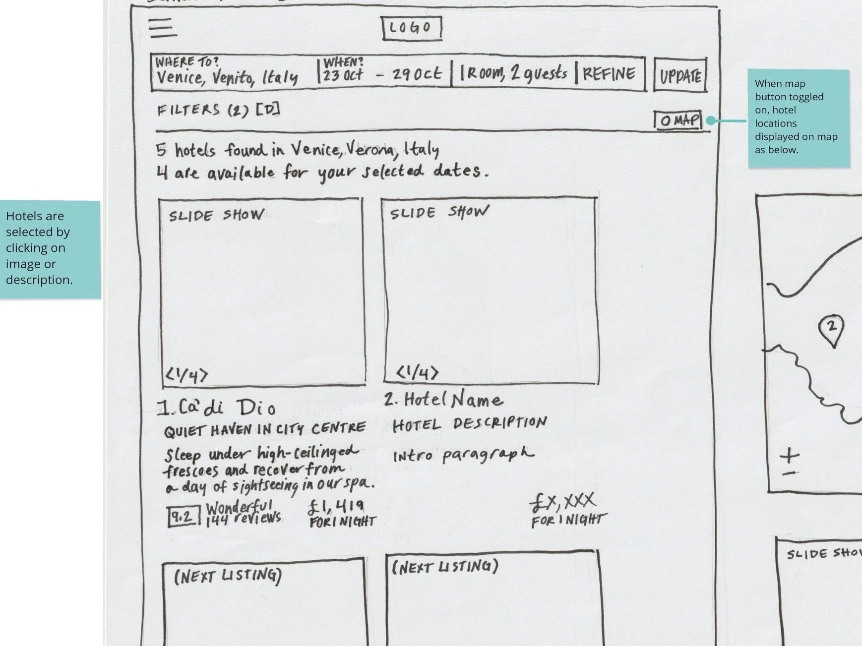
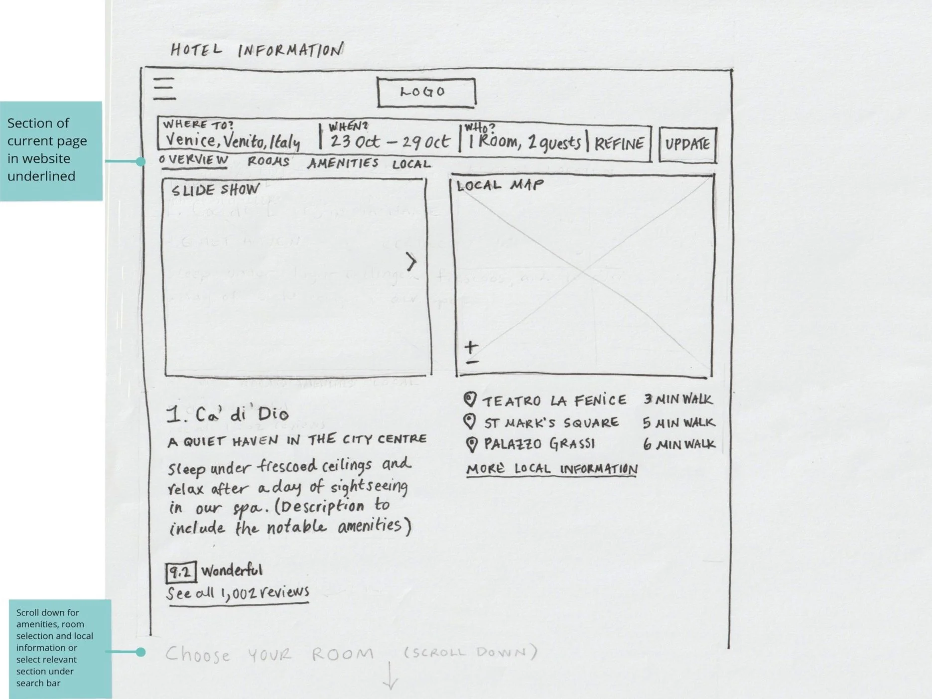
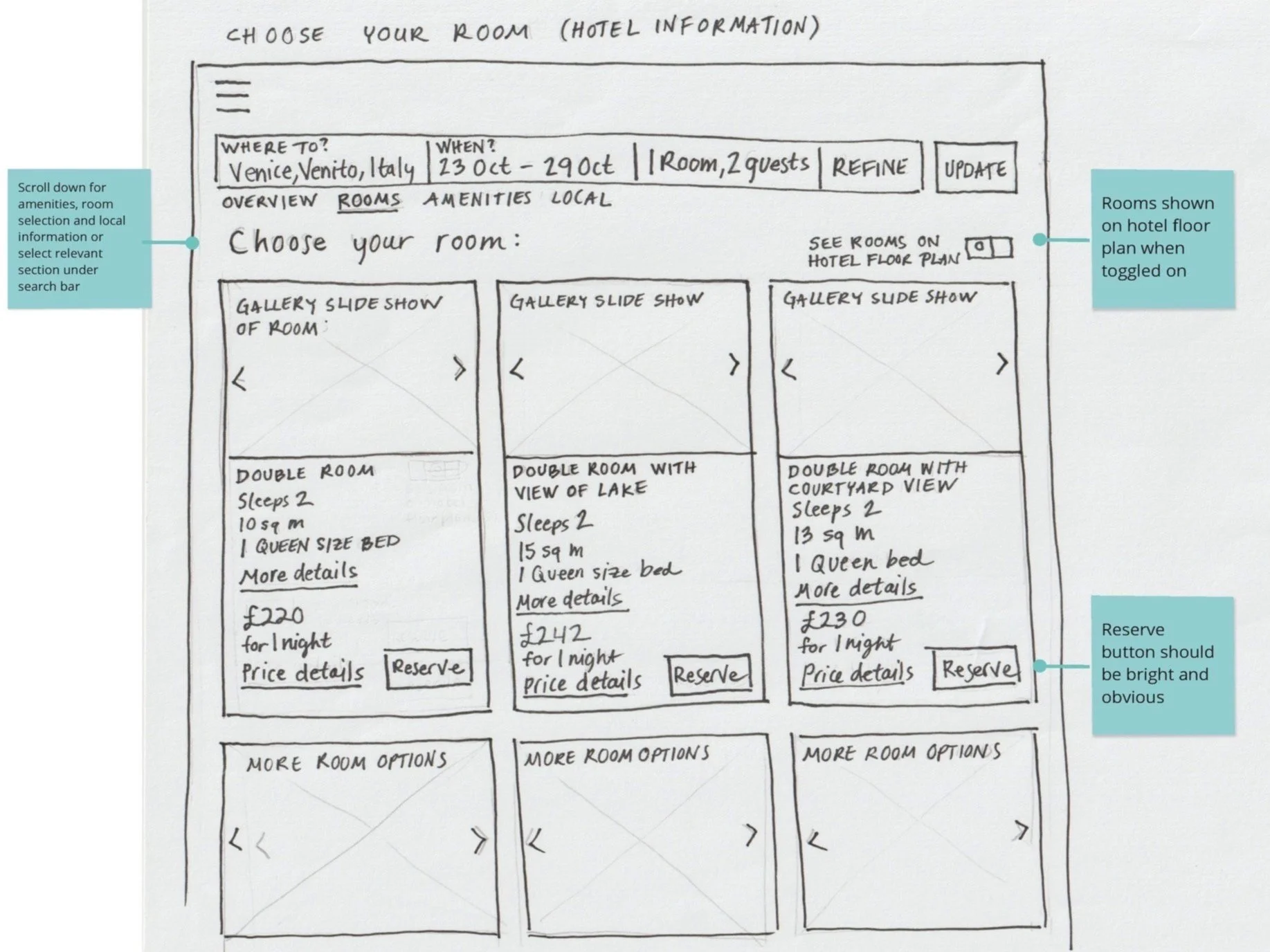
After establishing the user flow, I developed a series of interaction sketches to explore the layout, structure, and content hierarchy of each screen. In addition to predictive text for the “Where to” section of the search bar, I wanted to include a dropdown interactive map which highlighted regions on rollover, but for the prototype, I decided to focus on the primary user case when they knew where they wanted to go already.
Prototype
With the interaction sketches finalised, I developed a high-fidelity prototype. You can interact with it directly here:

Filters up front on the search bar
Simple navigation
Reduced clutter


Local points of interest
Interactive map to determine locale
Plenty of descriptive photos

Easily amendable search criteria
Descriptive photos and reviews
Easily comparable properties
Map to determine location
Transparent pricing
Descriptive photos
Option to view rooms on hotel floor plan
Annotations
To preserve the usability improvements and interaction patterns established during testing, I created comprehensive annotations for developers, clarifying expected behaviors, navigation flows, and interface details within the prototype. You can read these here: