ARC is a B2B risk and compliance software provider specialising in credit insurance solutions. The brand identity was developed to reflect its positioning within a highly regulated, risk-averse market while balancing innovation with trust and credibility.
The project began with a structured discovery process and Brand Sprint with key stakeholders to define purpose, values and market positioning. This insight-led foundation informed the development of a cohesive identity system designed to communicate clarity, authority and innovation across digital and communication touchpoints.
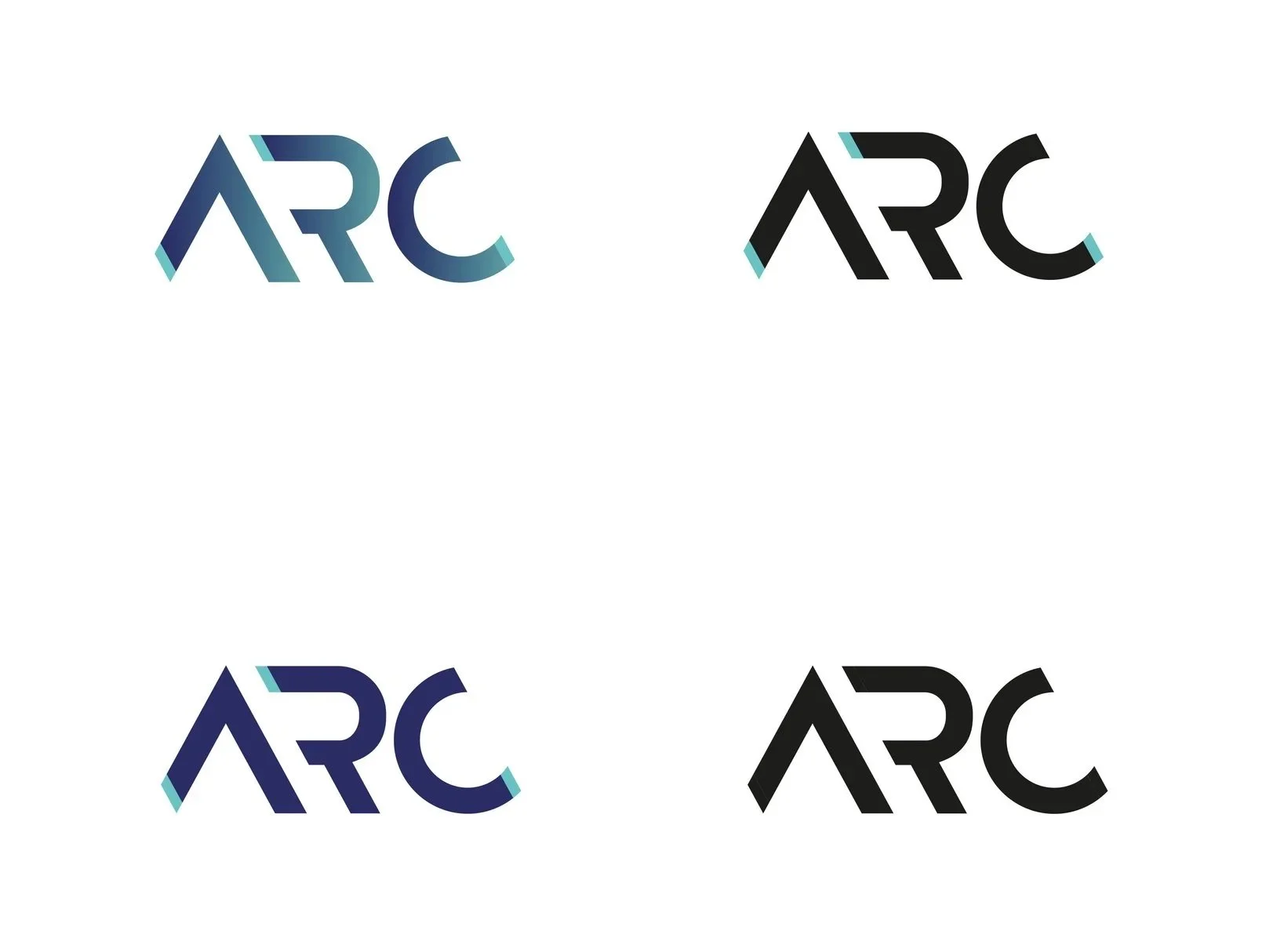
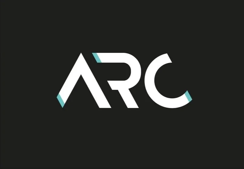
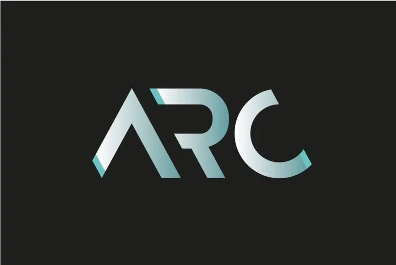
The visual identity combines a confident typographic wordmark with a restrained but contemporary colour palette, supported by subtle generative letterform details that suggest connectivity and problem-solving. Gradients and tonal variation introduce a sense of adaptability and forward motion, while the overall system prioritises clarity and control.
Affordability was positioned as a commercial advantage of ARC’s operating model and expressed through messaging and pricing strategy rather than visual language, allowing the identity system to focus on trust, expertise and leadership within the sector.
The resulting identity has been well received by stakeholders and establishes ARC as a confident, forward-looking brand within the credit risk technology space.
Client Testimonial
“As our primary software offering, ARC (previously Analysis of Risk and Compliance), has evolved over time, it has become widely recognised simply as “ARC” within our industry. With this shift in recognition, we saw an opportunity not only to shorten the name but to reimagine our brand identity in a way that reflects our core values: innovation, integrity, and affordability.
With Cathy’s expertise, the entire rebranding process was made straightforward and seamless. From the very beginning, her professional yet approachable demeanour put our team at ease. The Brand Sprint session was incredibly valuable, helping us home in on what mattered most and ensuring that the new logo would authentically reflect our mission and market position. Cathy carefully guided us through the creative process, presenting multiple logo concepts with varying colour palettes that each captured different facets of our company’s vision.
We were especially impressed by Cathy’s ability to distil our values of innovation and authority into a logo that is both modern and simple, yet visually impactful. The final result is a clean, confident design that feels perfectly aligned with our industry-leading software solutions.
We couldn’t be more pleased with the outcome and the collaborative process. Cathy’s thoughtful approach and design expertise exceeded our expectations. I would absolutely recommend Cathy’s services to anyone looking to refresh or develop a brand identity. Thank you, Cathy, for bringing our vision to life!”