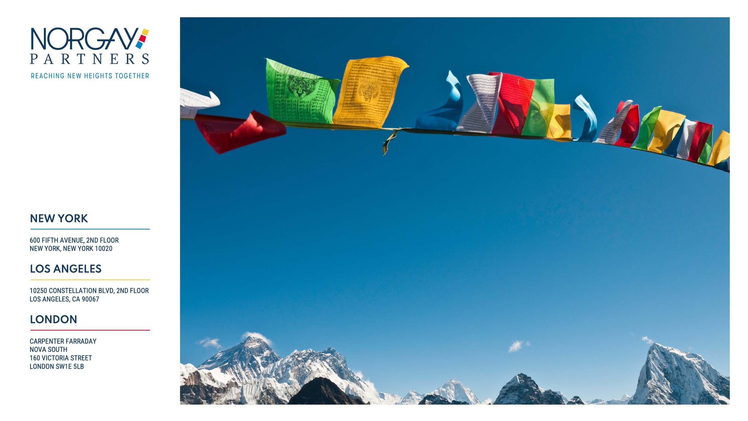
Norgay Partners are a people-focused executive search firm, inspired by Tenzing Norgay — the Sherpa mountaineer who, alongside Edmund Hillary, was one of the first to summit Everest. Their brand identity reflects this spirit of partnership, guidance, and ambition.
Clean and modern typography brings their brand into the present, while the predominately blue colour palette is a nod to their old brand and echoes the changing blues of the atmospheric sky around Mount Everest. Bright accent colours drawn from Tibetan prayer flags differentiate their three locations and celebrate the origin of the Norgay name.
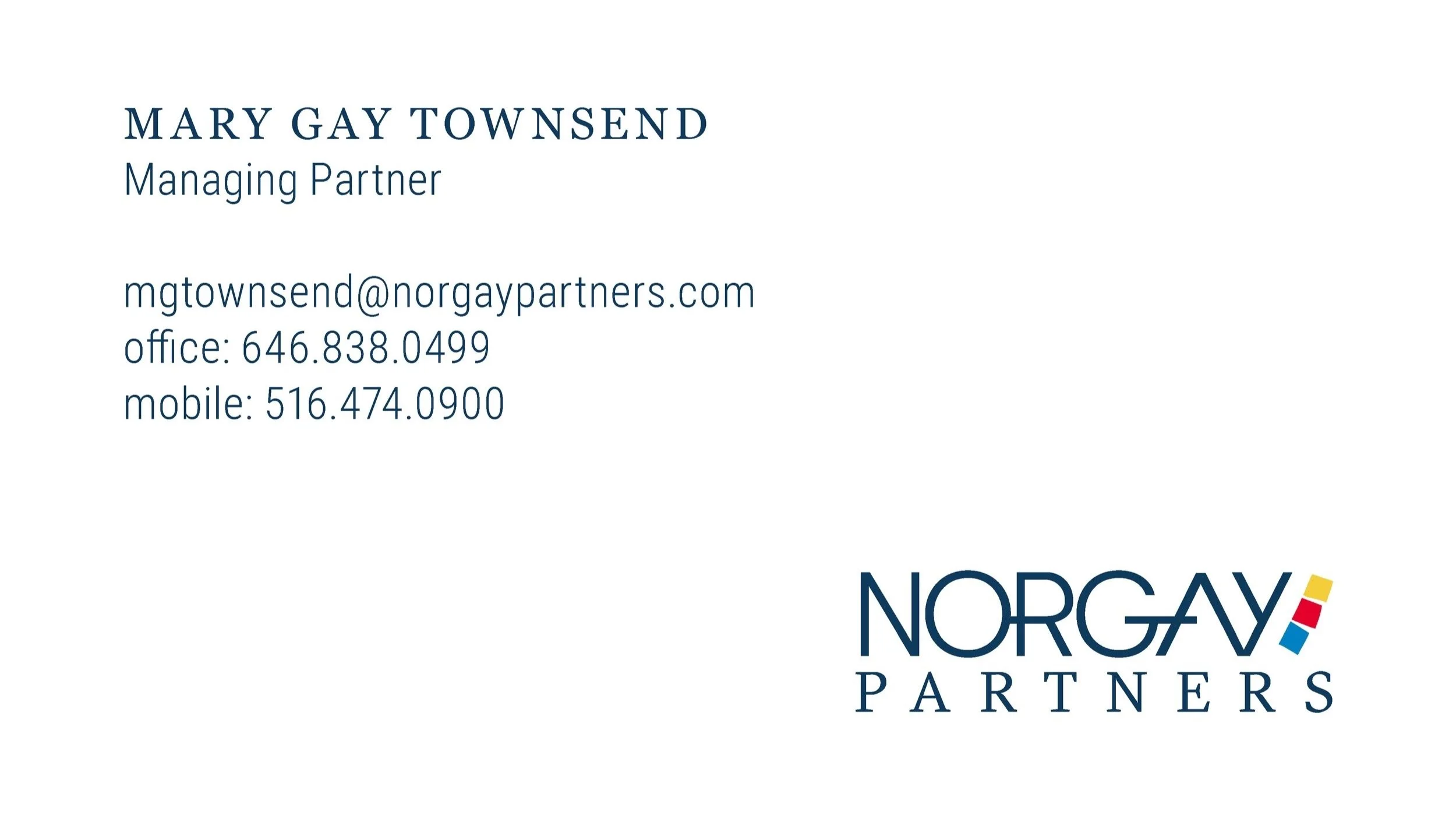
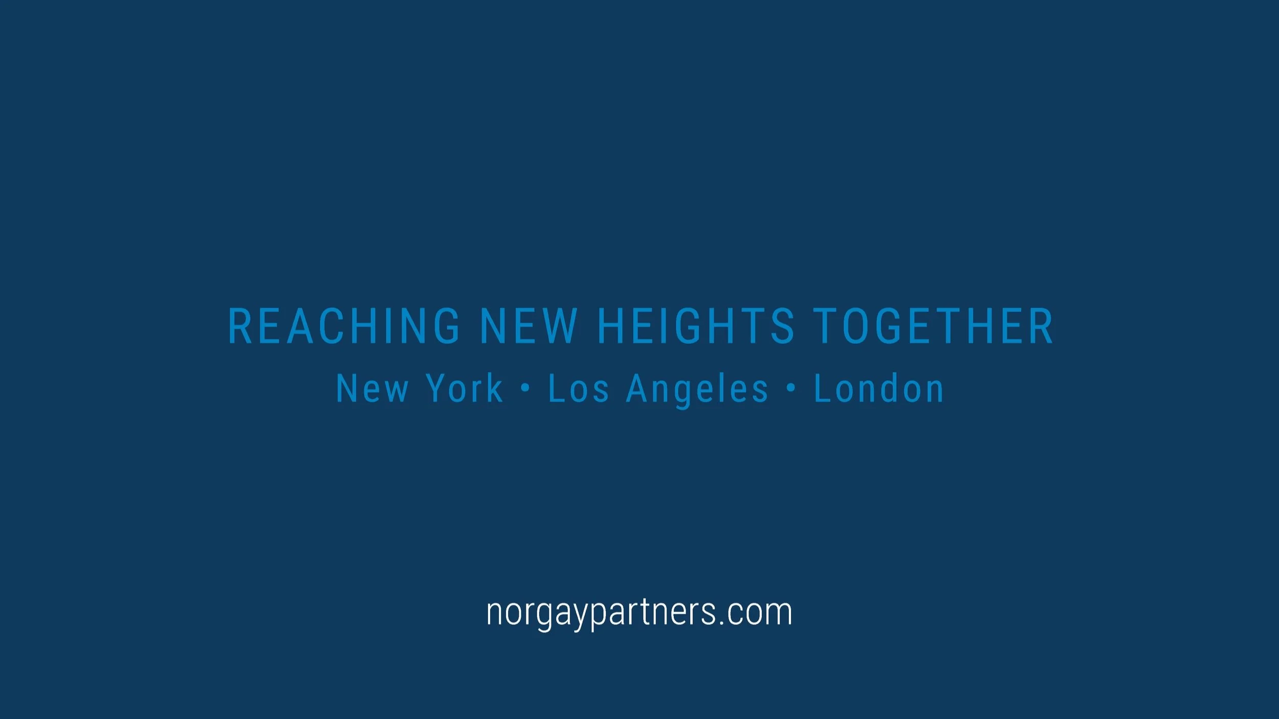
The custom ‘Norgay’ wordmark, based on GT Walsheim — itself inspired by 1930s alpine tourism posters — conveys warmth and precision, while the tightly set letters and crossing connections between them represent the close-knit team and their strong, supportive connections with their clients. ‘Partners’ is set in GT Sectra, a sharp yet human calligraphic serif, reminiscent of rocks with both weather-worn and sharp edges. The closely set, condensed tagline with its taller and narrower letters, also from the GT Walsheim font family, returns to the partnership and collaboration theme, and underscores the goal of reaching new heights, together.
This identity system balances modern professionalism with human warmth, expressing Norgay’s commitment to long-term, meaningful partnerships.