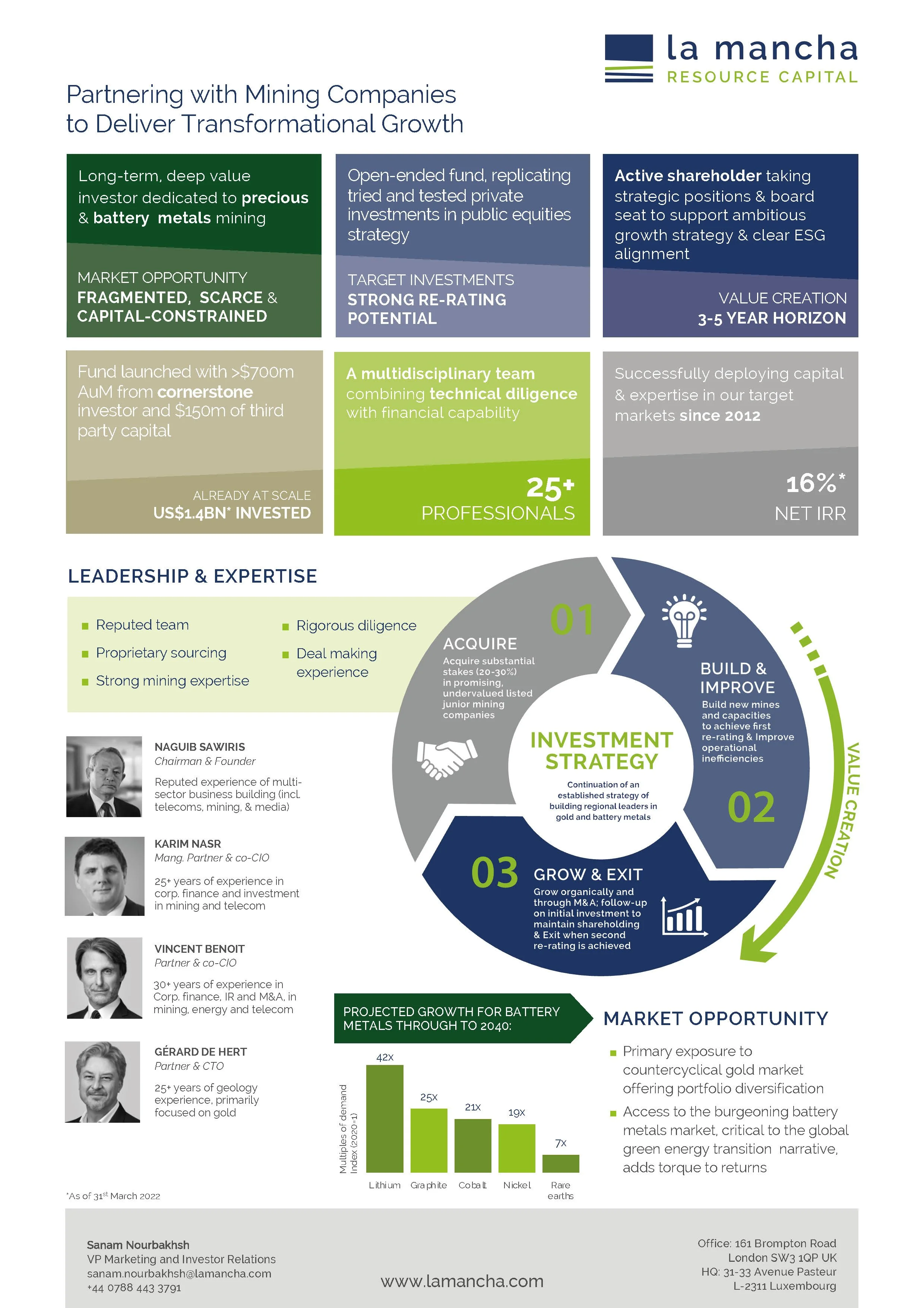

La Mancha Resource Capital advises on strategic investments for La Mancha Fund SCSp, a deep value, open ended alternative investment fund dedicated to gold and battery metals mining. The organisation supports portfolio companies to sustain organic growth by providing long-term capital as well as board level experience and expertise.
Working through Brackendale Consulting, I developed the brand identity and guidelines in close collaboration with stakeholders, ensuring the system aligned with both strategic positioning and practical application across the business.
The identity was designed to operate consistently across multiple formats and has since been extended into investor communications, ESG reporting and presentation materials.
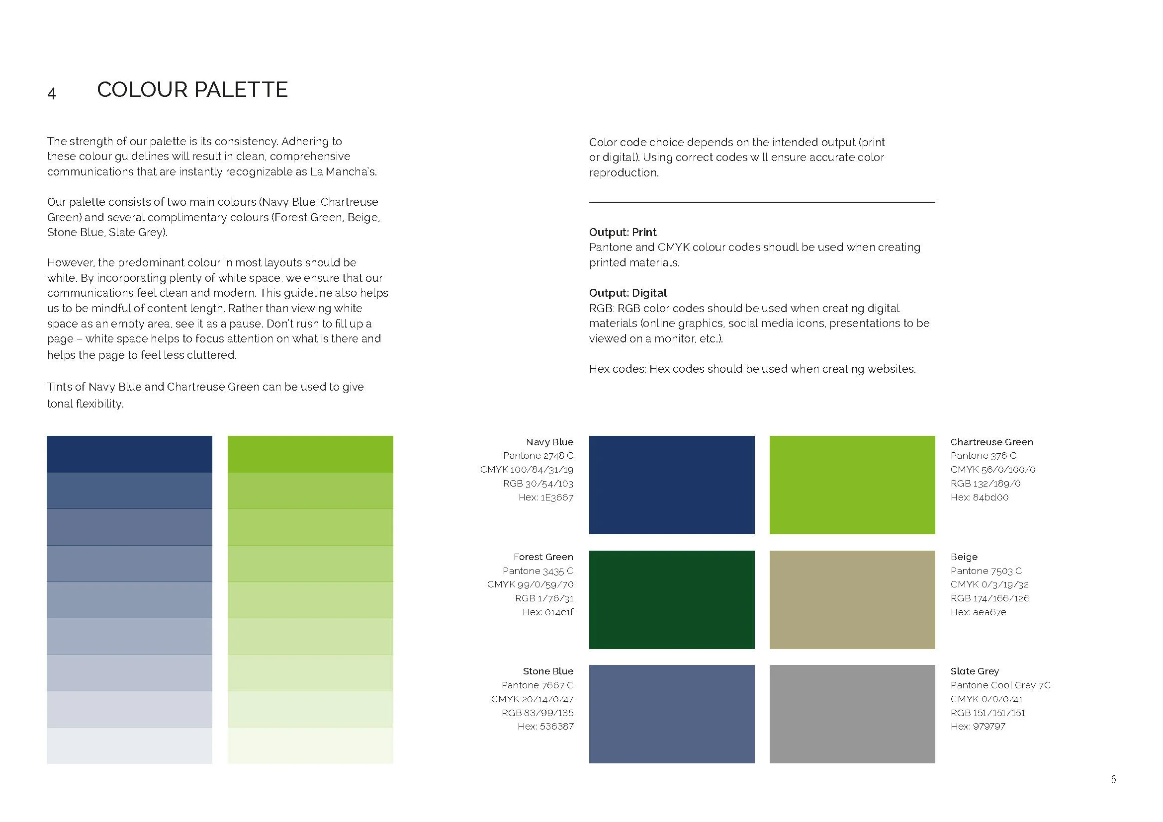
The logo combines a clean, functional typographic mark with a simple device referencing geological strata, reflecting stability, longevity and layered growth. A restrained palette of navy blue with a chartreuse accent supports a contemporary, high-trust positioning, with the accent colour also reinforcing themes of progress and responsibility.