
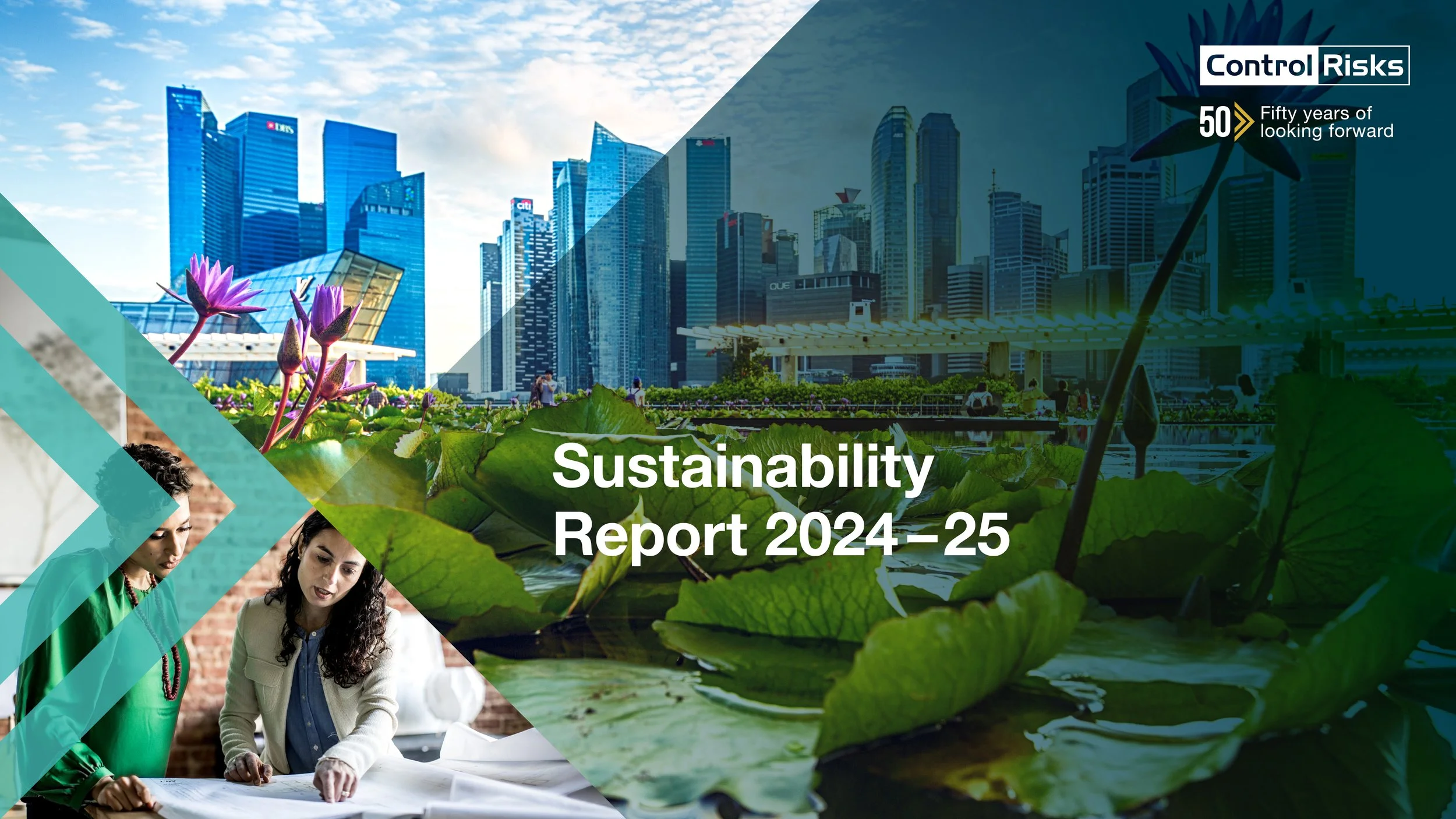
I designed this Sustainability Report within Control Risks’ evolving brand framework, balancing continuity with previous materials while delivering a clear and accessible editorial experience for complex content.
Drawing on recent UX accessibility training, I applied WCAG 2.2 principles throughout the report, considering colour contrast, typography, text spacing and layout accessibility to improve clarity and readability across the document.
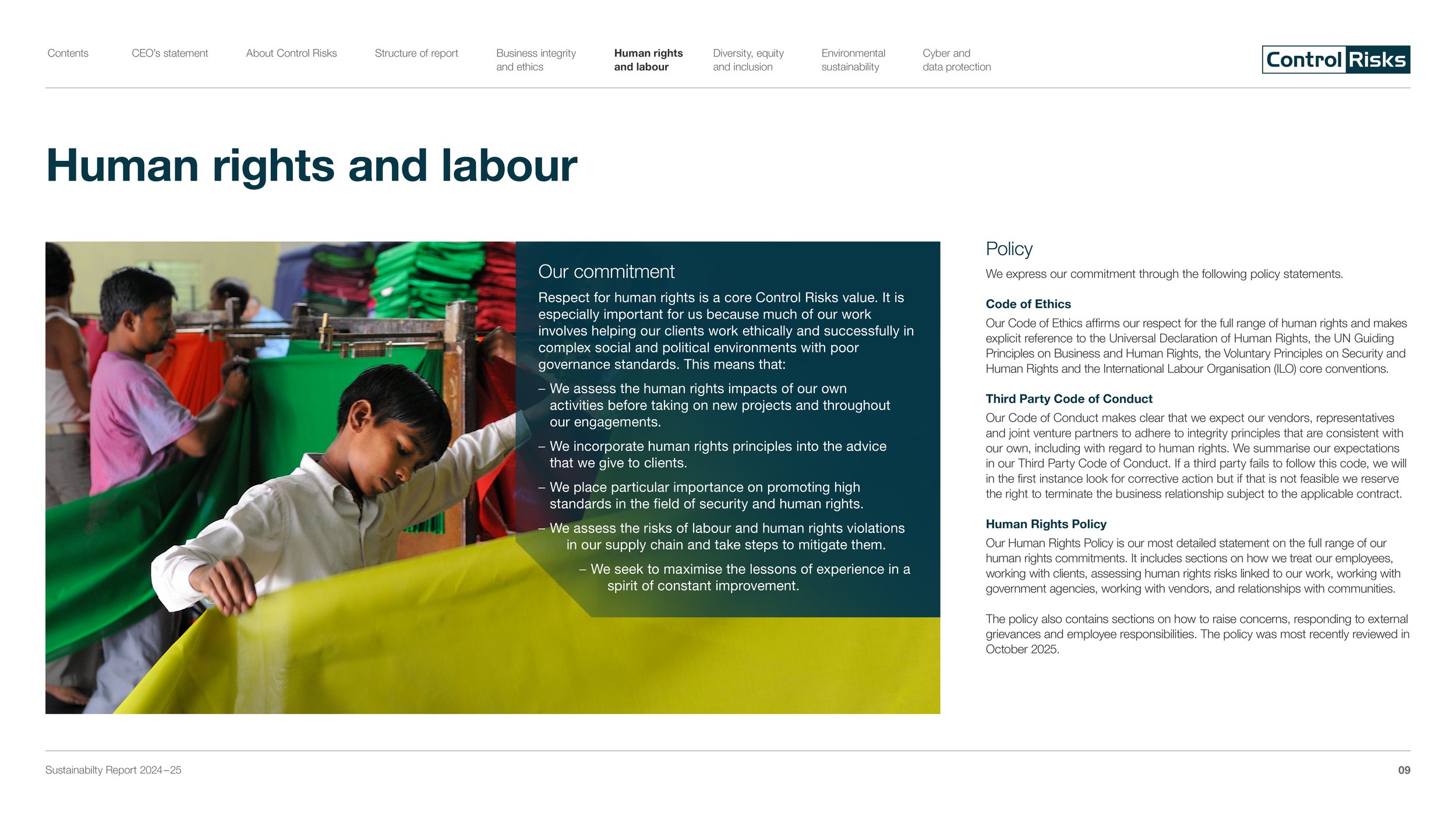
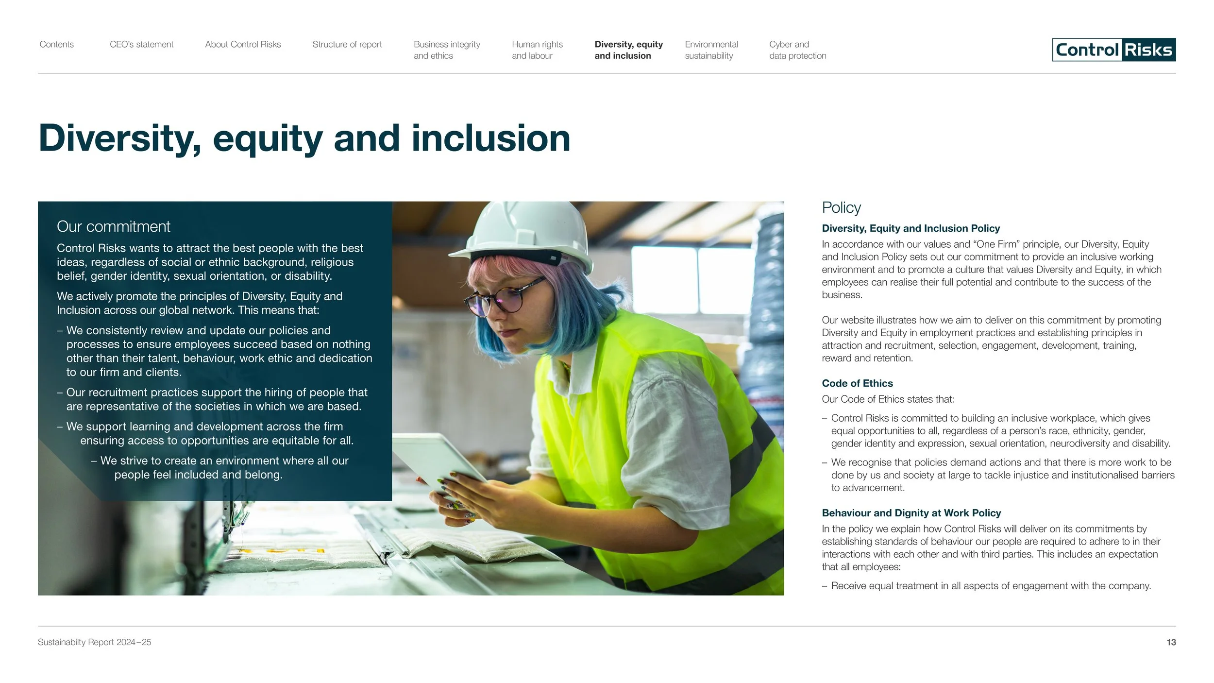
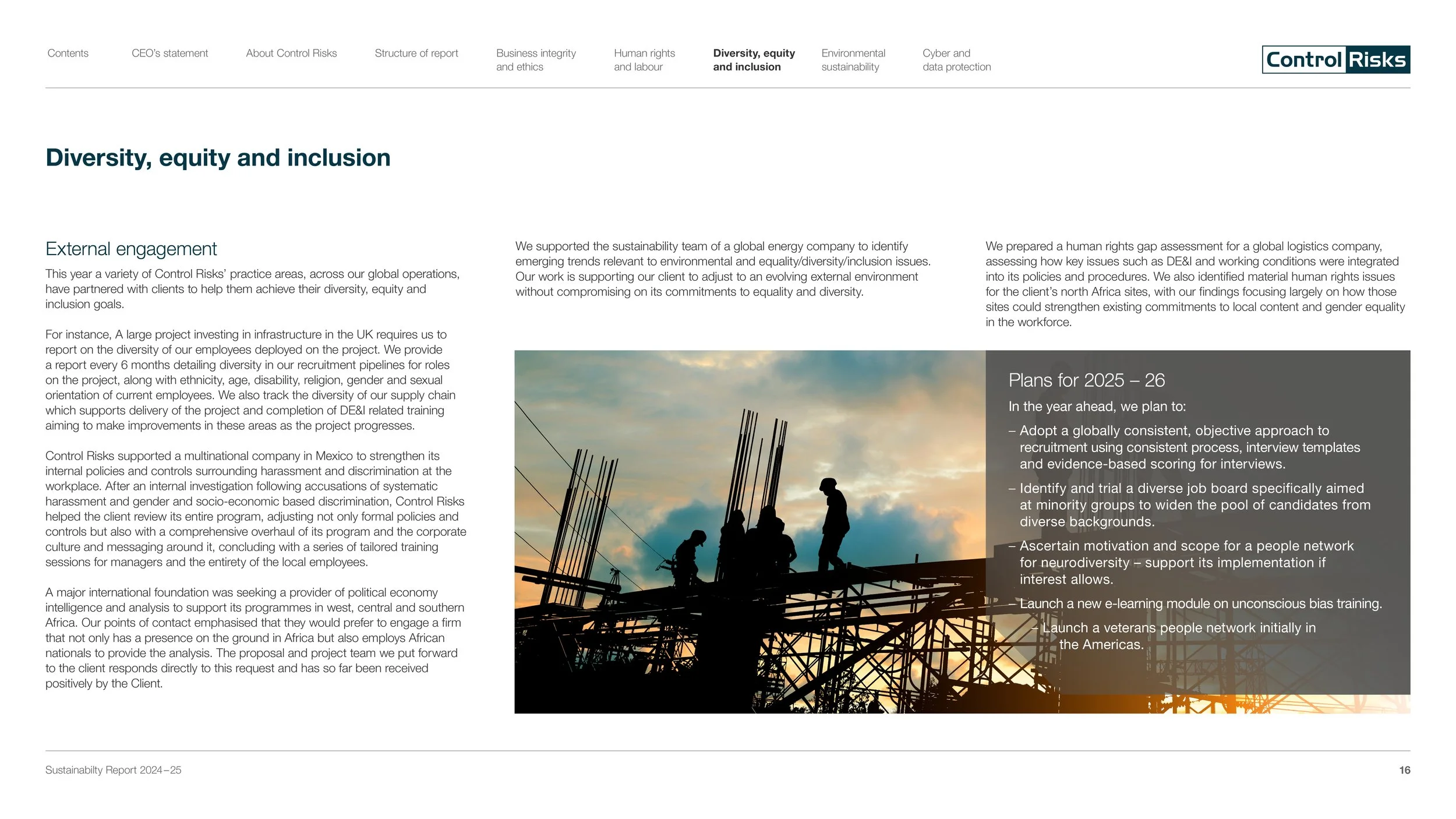
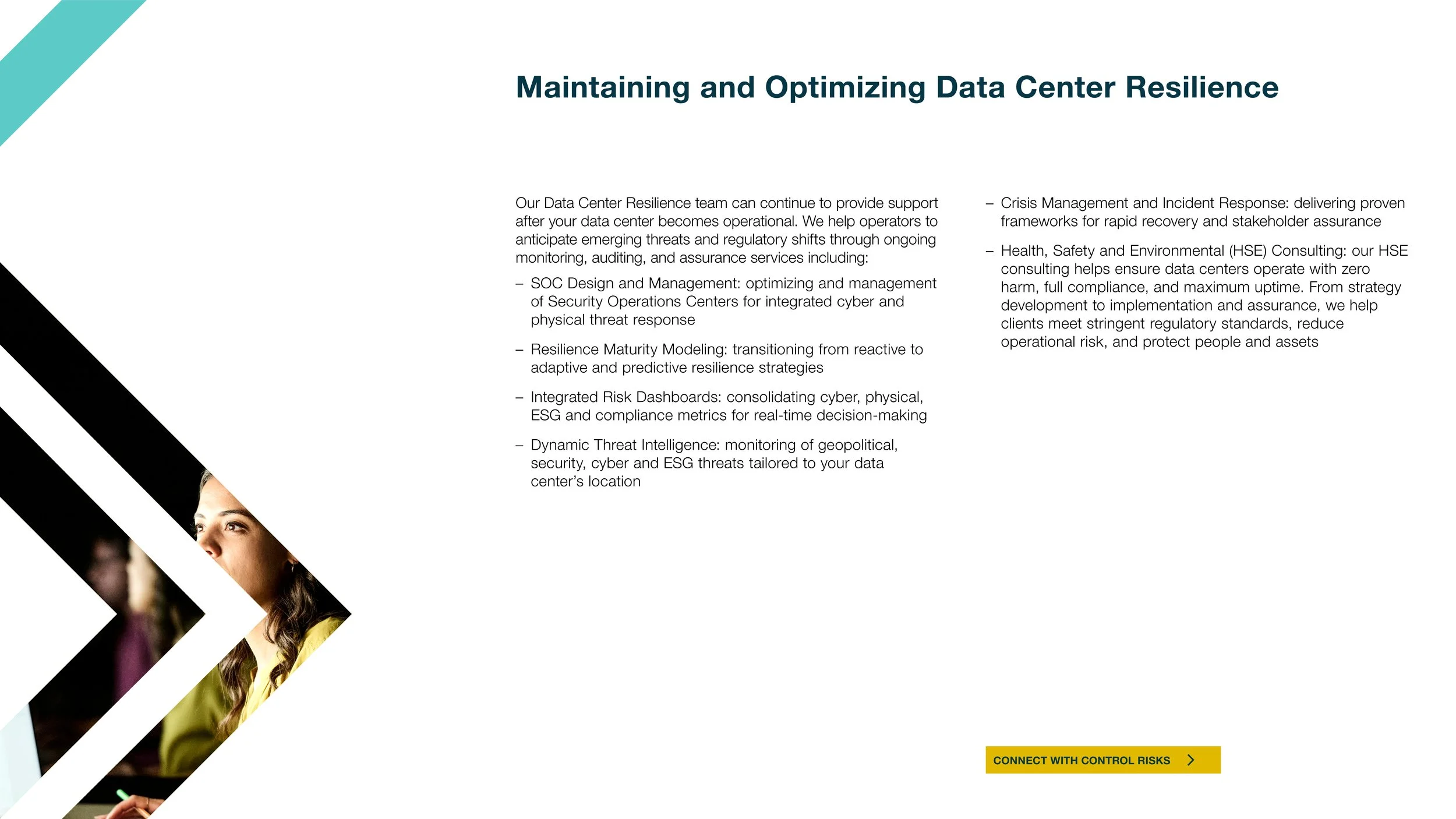
I also sourced and curated imagery aligned to the evolving brand guidelines, selecting photography that reflected a global perspective while maintaining a human and story-led visual tone.
The project introduced new visual approaches that were later adopted across other reporting templates and communications, with the report continuing to be referenced internally as a benchmark for high-quality corporate communications.


Digital brochure design for Control Risks as part of an evolving approach to editorial communications, moving away from static, print-led PDFs towards more considered digital reading experiences.
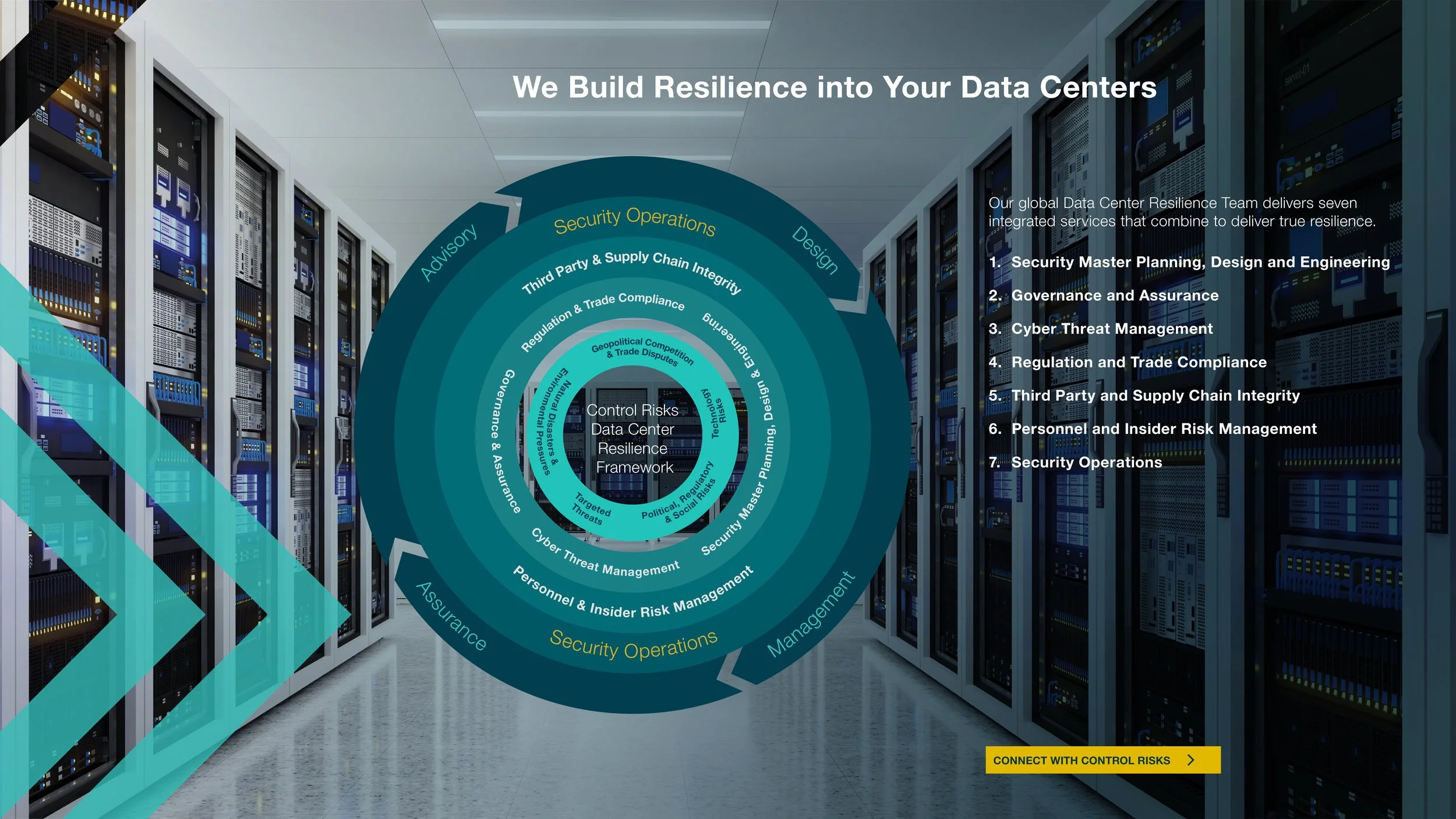
I developed and refined the format across iterations, resolving structural and usability challenges including navigation, pacing and hierarchy within a continuous scrolling layout. The design introduced clearer content rhythm, including intentional white-space sections to support cognitive relief and improve readability across longer-form content.
The work also involved sourcing and curating imagery and extending existing brand devices, including integrating photography within the chevron system and evolving gradient treatments to improve contrast, legibility and visual clarity across digital formats.